
Concept project · Brand identity
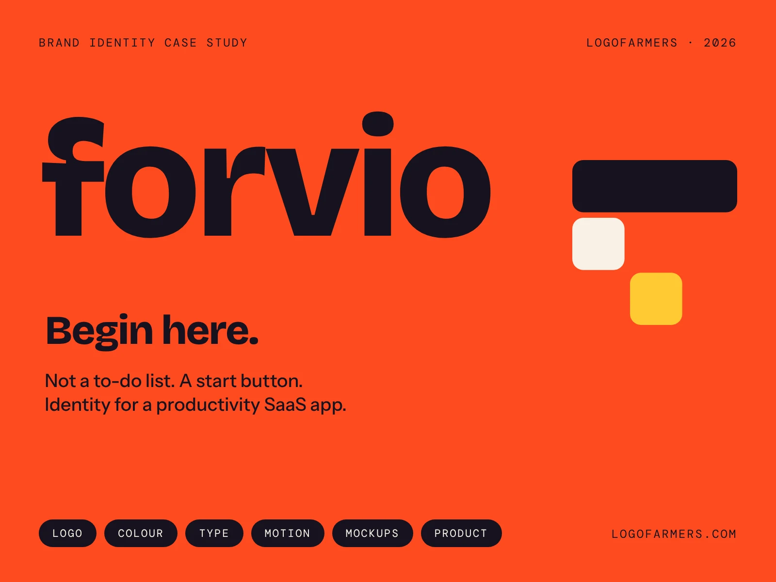
Forvio.
Brand identity for a productivity SaaS app. Not a to-do list. A start button.
The idea
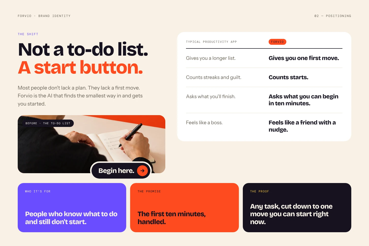
Progress starts with a first step.
The whole identity rests on one idea: progress is just a first step, followed by the next one. The mark, the colour and the voice all show that small move forward, so using the product and seeing the brand feel like the same thing.
Logo
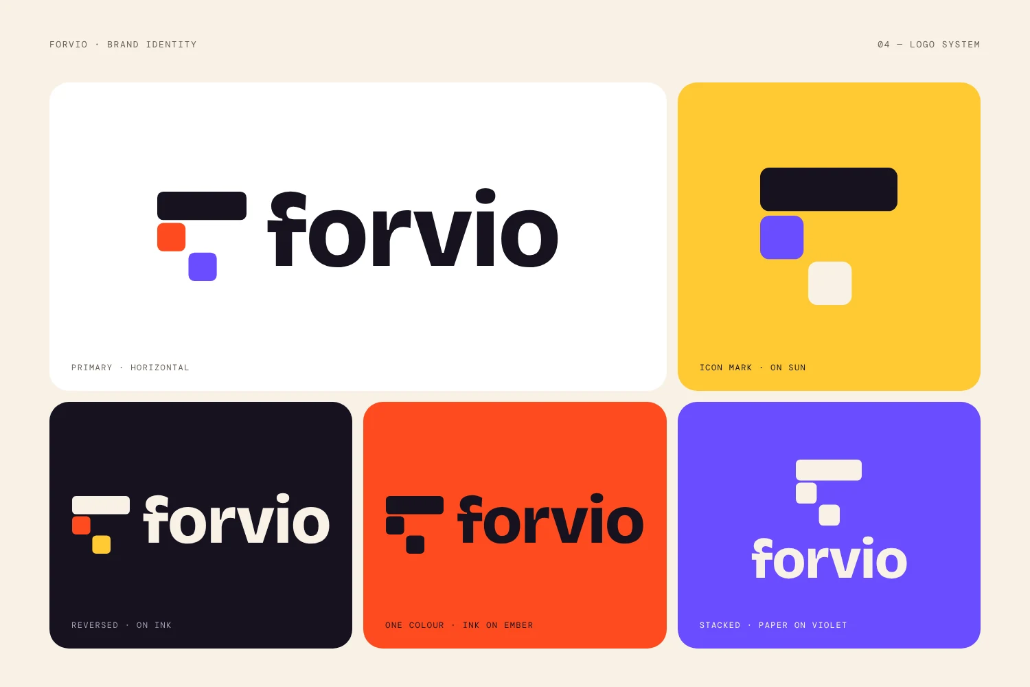
Three blocks. One start button.
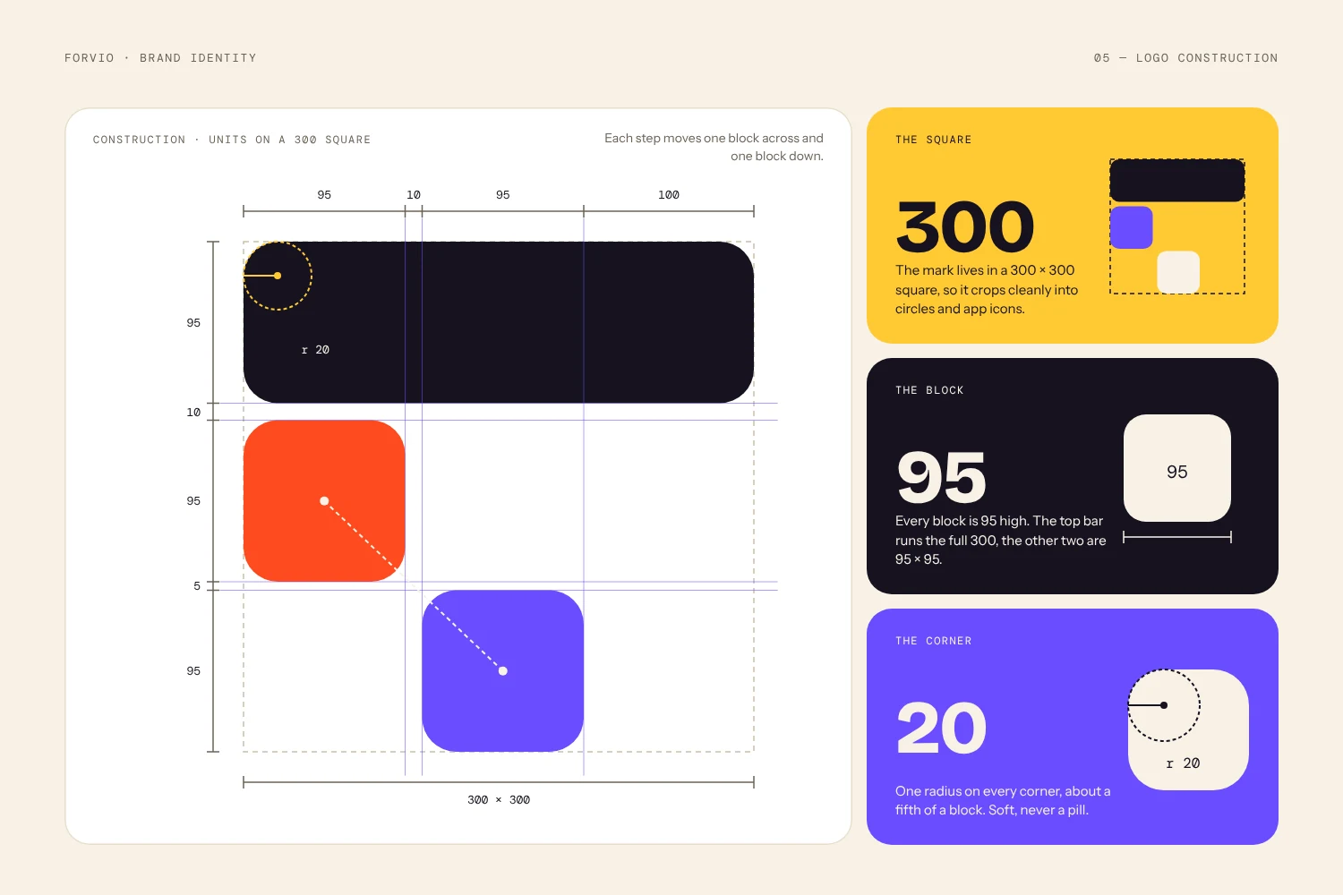
The mark is three rounded blocks on a 300 unit grid: a top bar, a first step and a next step. Together they read as a progress bar that fills as you work. The wordmark is lowercase Bricolage Grotesque for a friendly, confident voice.
Colour and type
Flat colour. Loud headlines. Calm words.
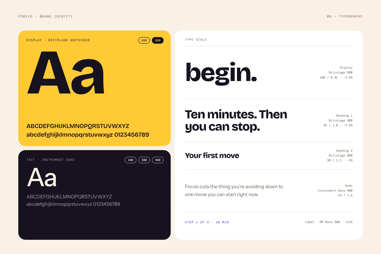
Ember is the action colour. Sun brings warmth, Violet adds focus, Ink and Paper carry the reading. No gradients anywhere. Type pairs Bricolage Grotesque, Instrument Sans and DM Mono, each with a clear job.
The product
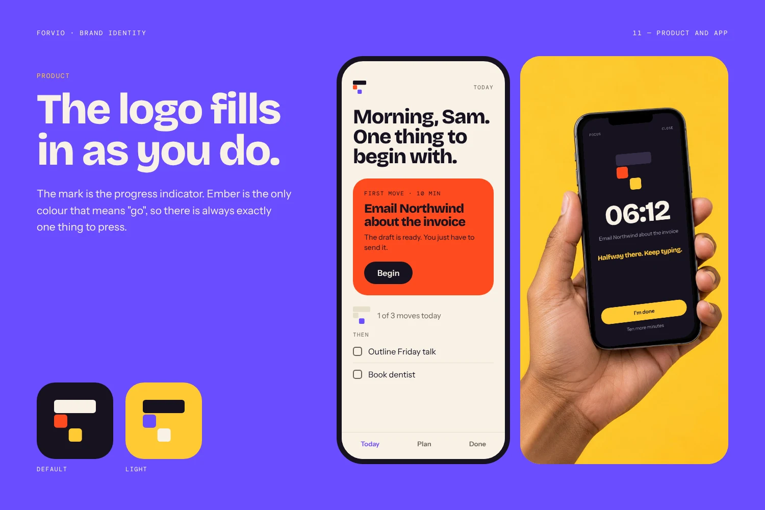
The logo fills in as you do.
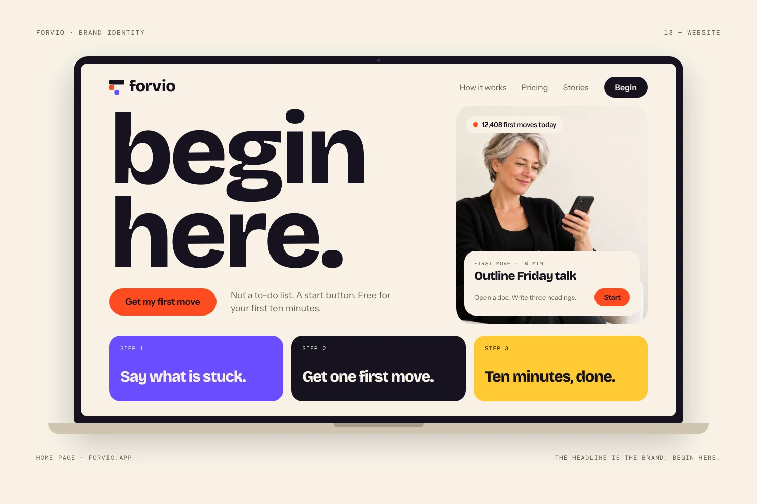
In the app, the mark doubles as the progress indicator. Ember means go, so every screen has one clear thing to press. The same system carries into the website.
In the world
On the feed, on the street, on the shelf.
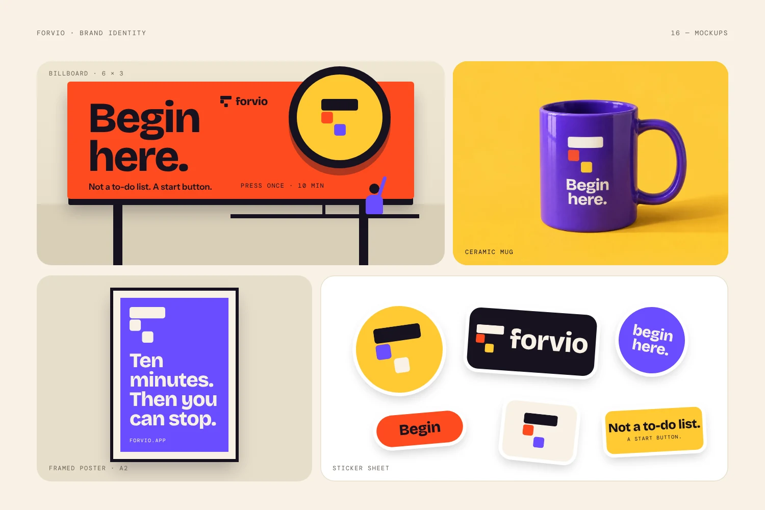
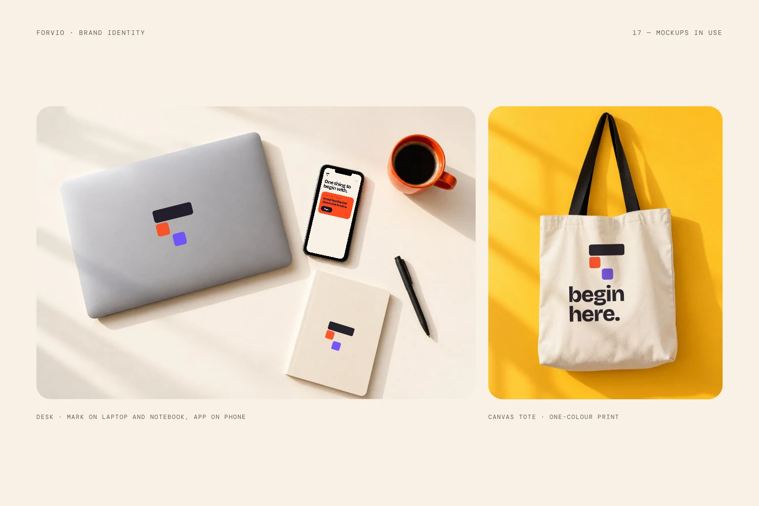
The identity is built to travel. Social posts, a billboard concept, a mug, a tote and a laptop sticker all use the same three blocks and one idea.
About this project. Forvio is a fictional company. LogoFarmers created this identity to show how we build a complete brand system for a tech product, from the first idea to the last mockup. It is not client work.
Need an identity like this?
Tell us about your company, industry and timeline. We reply within 24 hours.
Start a projectSee all work