
Logistics · Brand identity
SOVEX
A logistics brand built on movement, precision and trust. One geometric mark, a disciplined red-and-ink palette, and a system that works from a truck door to a scanner screen.
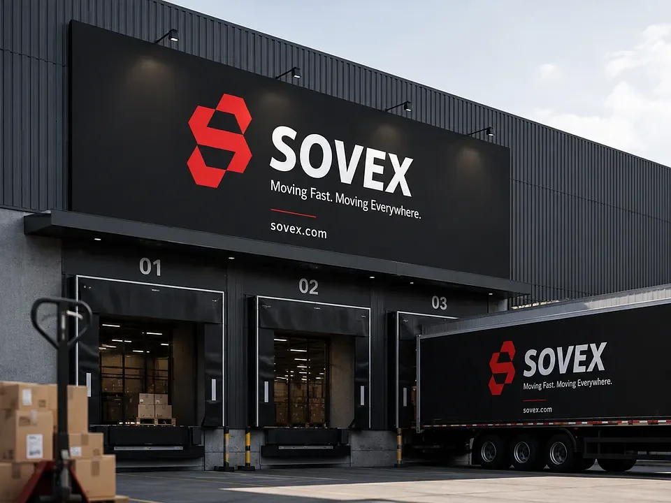
01
The brief
Fast and reliable, across trucks and screens
A logistics company wants a brand that feels fast and dependable, works across trucks, warehouses and handheld scanners, and stands out from the blue-and-grey default of its category.
What it must say
Speed, control and accountability. Customers should trust that their cargo moves on time and is tracked at every step.
What it must do
Reproduce at favicon size, print on tape and tyres, and carry onto a vehicle at highway distance.
02
The mark
Movement, built from hexagons
Every edge sits on one triangle grid, with module proportions of 1x, 3x and 1x, so the S keeps its rhythm at any size. Each hexagon is a unit of cargo; the S is the route it travels.
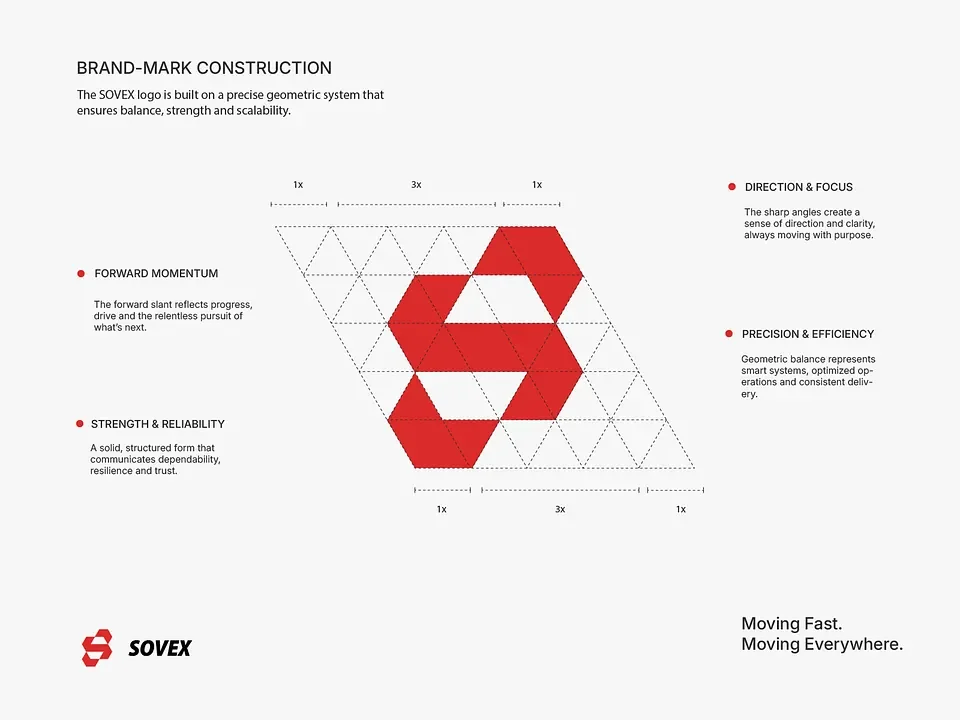
Forward momentum
The forward slant reads as progress and the drive toward what is next.
Direction and focus
Sharp angles give a sense of direction. The mark always points somewhere.
Precision and efficiency
Geometric balance signals smart systems and consistent delivery.
Strength and reliability
A solid, structured form that communicates dependability and trust.
03
Colour
Signal red, ink and mist
Signal red does the attention work. Ink carries the weight. Mist and white keep documents and screens calm enough to read.
Mark, accent and status. Used sparingly.
Vehicles, signage and primary text.
Secondary text and linework.
Backgrounds and cards.
On any surface, use roughly 60 percent ink or mist, 30 percent steel and neutrals, and no more than 10 percent red. Red marks the moment that needs attention.
04
Typography
A condensed display, a plain reading face
A condensed heavy sans for headings and signage, paired with an open sans for reading. Both are free on the web.
Moving fast.
Moving everywhere.
Barlow Condensed ExtraBold for headings, labels and signage. Barlow Regular and Medium for body copy, tracking data and documents. Tabular figures keep shipment IDs, weights and times aligned.
05
Applications
Trucks, doors, tape and screens
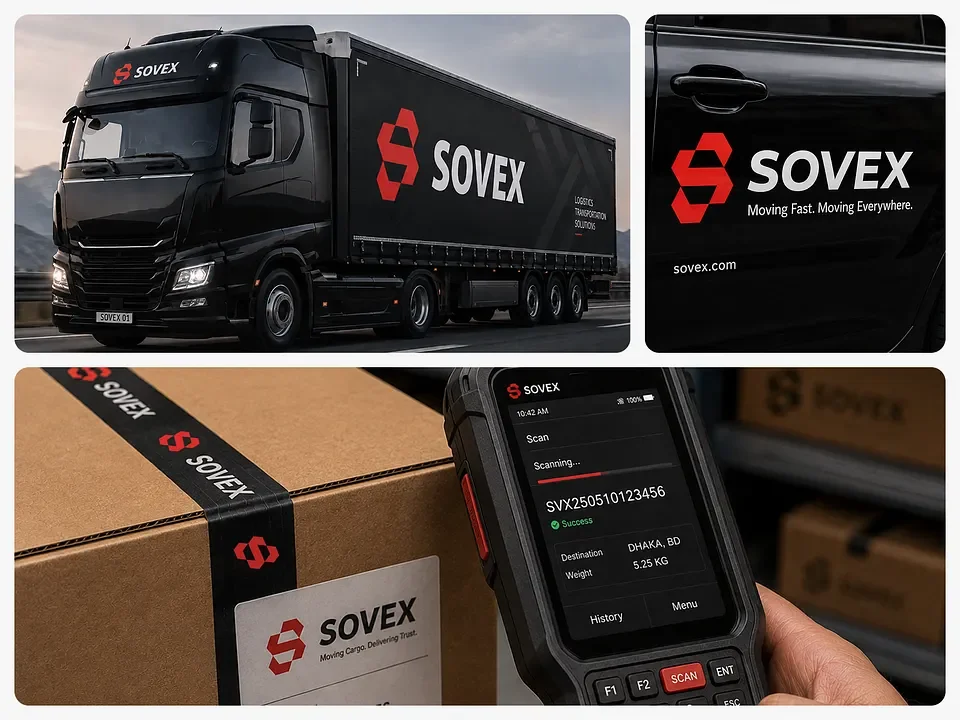
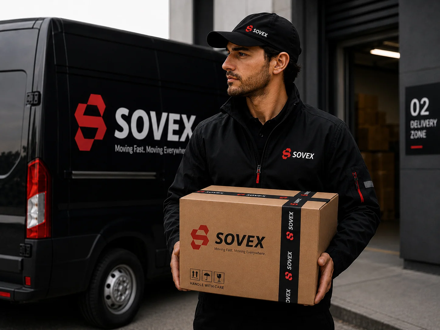
The system is tested where logistics brands are actually seen: on vehicles, in warehouses, on parcels and in the hand.
06
Mockups
The system in real settings
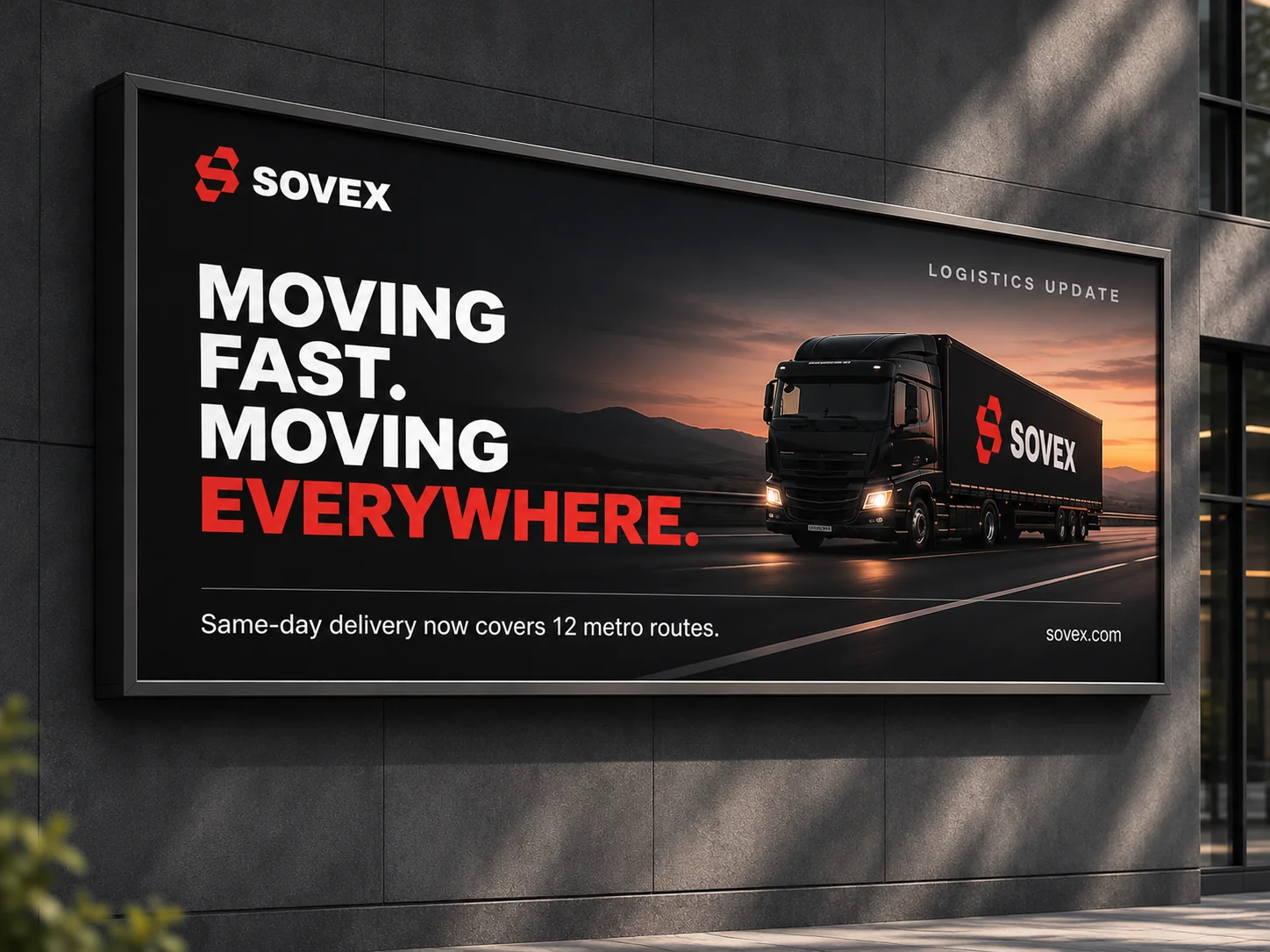
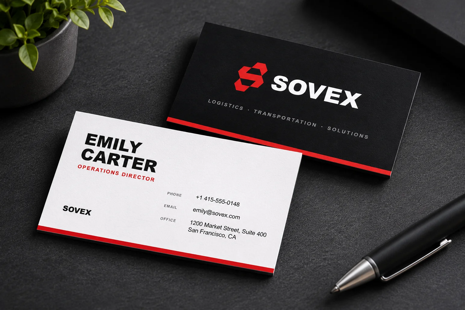
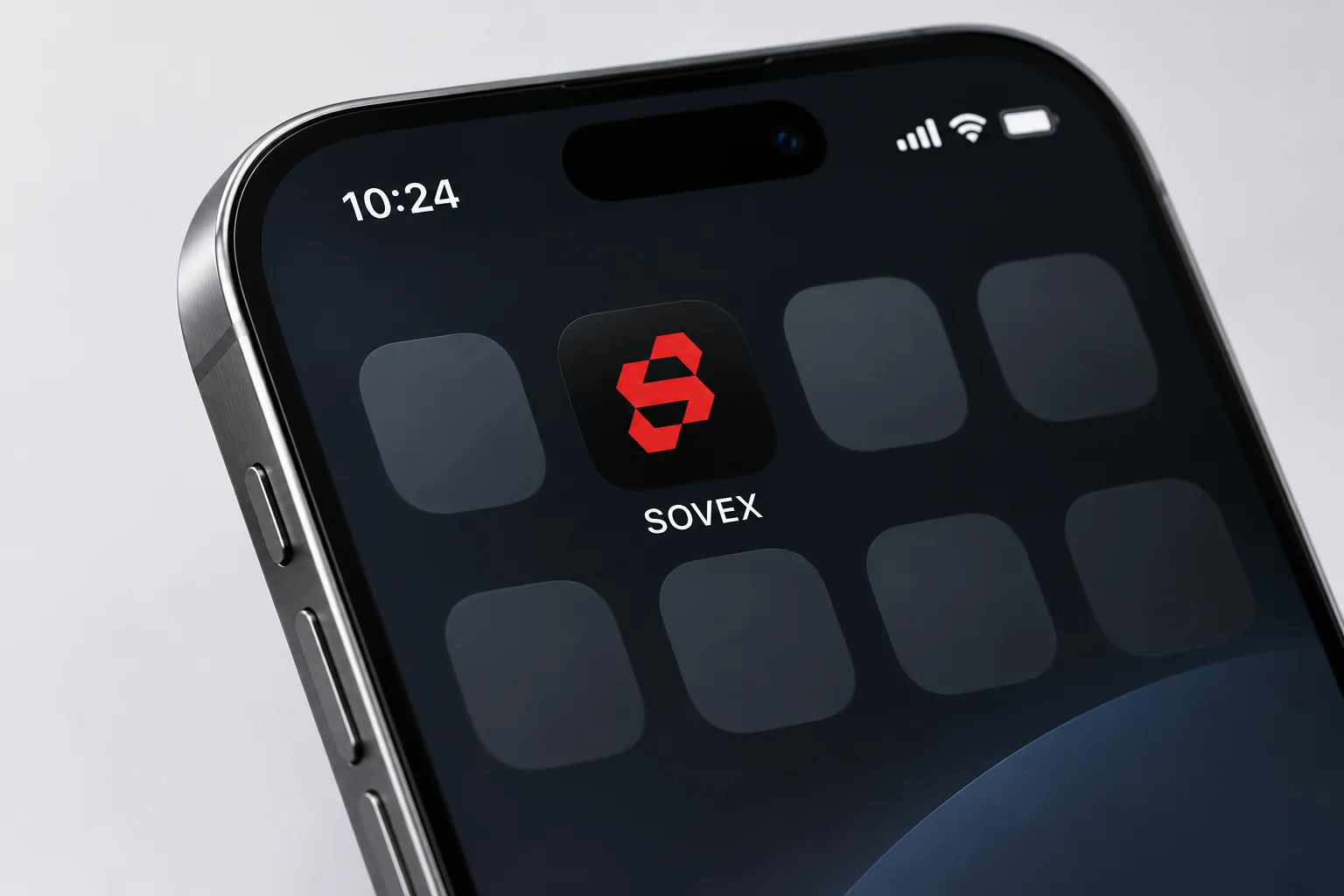
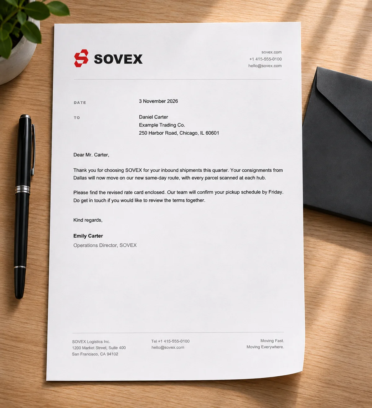
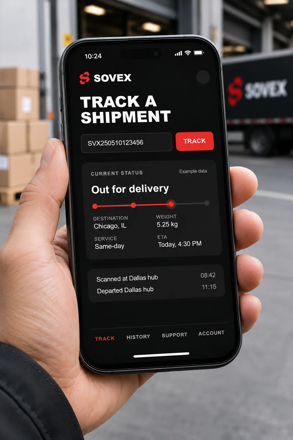
The approved artwork shown on a billboard, business cards, a letterhead, an app icon and a tracking screen.
07
The system
Rules that keep it consistent
Five rules that hold the brand together when many people apply it on many surfaces.
- 01Mark on dark
Use the red mark on ink, or white and mist on dark backgrounds. Never place it on a red field.
- 02One accent per surface
Red appears once per layout: the mark, a status or one call to action.
- 03Tagline placement
The tagline sits under the wordmark at 40 percent of its height, never above it.
- 04Tape and print
Repeat the mark along parcel tape at a fixed interval, black on kraft or white on black.
- 05Data and status
Scanner and dashboard screens use ink backgrounds, mist text, and red only for exceptions.
Need an identity like this for your brand?
Tell us about your logistics or transport business and we will suggest the right scope.