You can redesign your logo without losing brand recognition, as long as you change the execution and keep the memory structures people already link to your brand. Recognition lives in a few cues: shape, colour, name treatment and sometimes a symbol. Protect those, and modernise everything else. This is the same idea behind most successful rebranding projects.
Start With an Audit, Not a Sketch
List what people already notice about your logo. Ask five to ten customers to describe it from memory. The elements they mention first (a colour, a mark, a distinctive letterform) are your recognition assets. Those stay.
Decide How Far to Go
Most redesigns fall into three levels:
- Refine: clean up proportions, spacing and line weight. Customers barely notice, but the logo looks sharper.
- Evolve: keep the core mark and palette, but simplify detail, update the typeface and improve small-size legibility.
- Rebuild: a new concept. Choose this only when the old logo is actively hurting the business, such as after a major pivot or a merger.
For most small and growing businesses, evolve is the safe, high-return choice. If you want to know whether a redesign is worth it at all, read why a logo redesign could boost your business’s image.
Keep Your Anchors
Hold on to your main colour, or at least its hue family. Keep the silhouette of your symbol. If you change the typeface, match the weight and spacing feel so the wordmark still reads the same at a glance.
Fix What Actually Fails
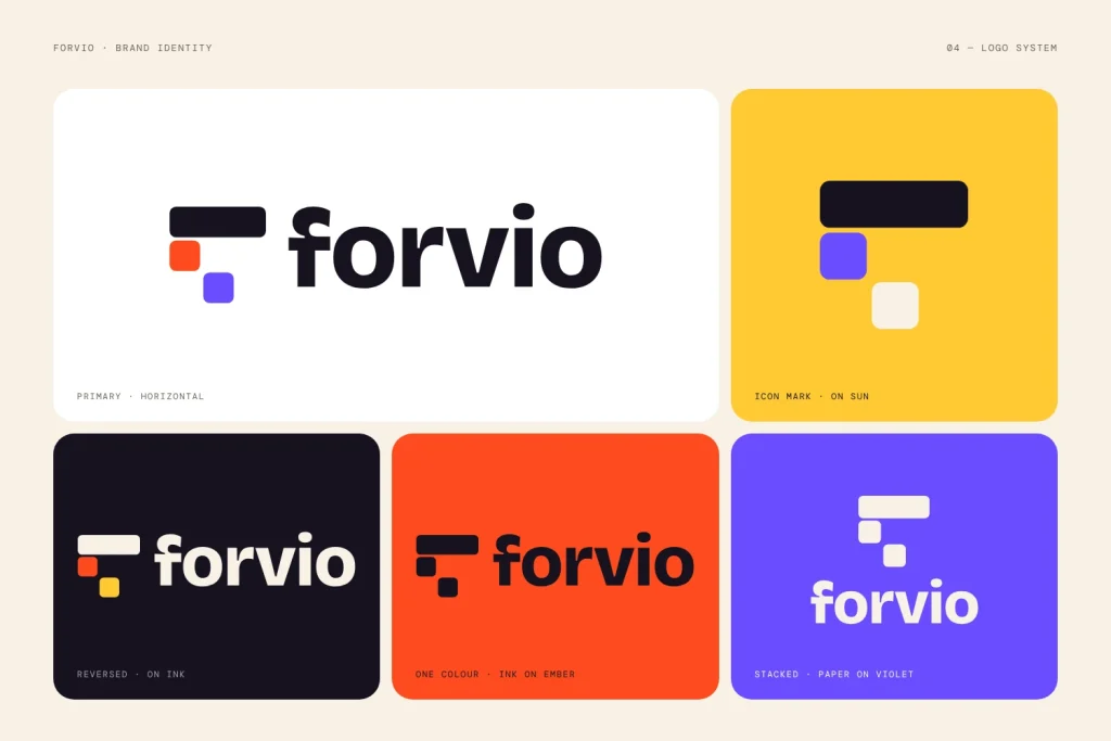
Good reasons to redesign your logo include a logo that is unreadable at favicon or social-avatar size, a design that breaks in one colour, outdated styling that signals an old company, or too many details to reproduce on signage, embroidery or packaging. Redesigning only because you are bored with it is a weak reason.
Test Before You Launch
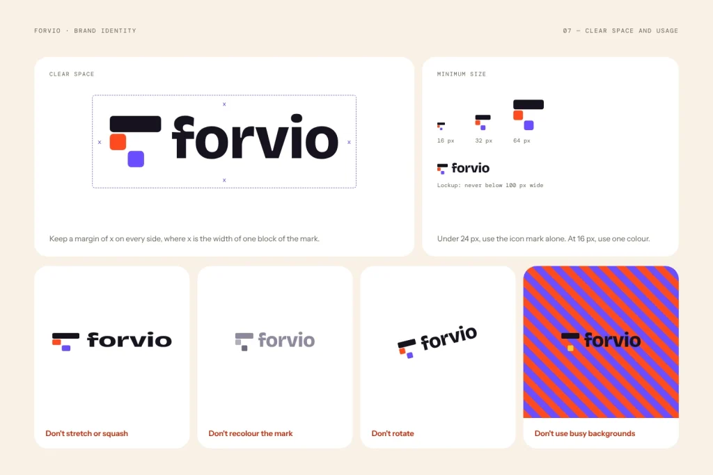
Show the old and new versions side by side and ask: do these look like the same company? If most people say yes, you have kept recognition. Also test at 16 px, in black and white, and on a busy photo background. Our guide on how to test a logo covers the full process.
Roll Out in a Planned Way
Update the high-visibility places together: website, social profiles, email signature, invoices and packaging. Then phase in printed stock as it runs out. Tell your audience why you changed, with a short post and a before-and-after image. People accept change they understand. Use our checklist before launching a new logo to avoid missing a step.
Final Checklist
- Recognition assets identified and kept
- Redesign level chosen (refine, evolve or rebuild)
- Tested at small sizes and in one colour
- Old and new compared with real customers
- Rollout plan and announcement ready
Frequently Asked Questions
How do I redesign my logo without losing brand recognition?
Find the cues customers remember (colour, symbol, letterforms), keep them, and update the execution around them. Test old and new side by side before you launch.
Will customers notice if I change my logo?
They notice big changes more than small ones. A refine or evolve update keeps the core mark and palette, so most people see a sharper version of the same brand.
Should I change my logo colours in a redesign?
Only if the colours hurt you. If you must change them, stay in the same hue family so the brand still feels familiar.
How often should a logo be redesigned?
There is no fixed schedule. Redesign when the logo fails in practice, no longer fits the business, or looks dated, and prefer light refinements over full rebuilds.
A good redesign feels like your brand has grown up, not like it has been replaced. If you want help finding that balance, the LogoFarmers team can review your current logo and recommend the right level of change. Start a project, browse the logo shop, or email hello@logofarmers.com.