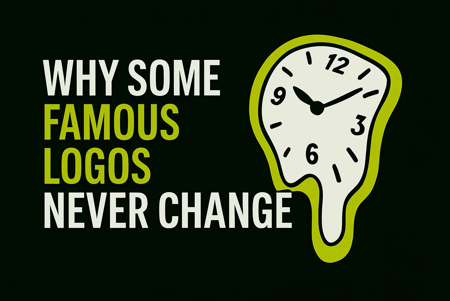
In a world where trends shift overnight and brands rebrand every few years, some logos… stay exactly the same.
Think Coca-Cola. Chanel. Nike. IBM.
So what’s the secret?
At LogoFarmer’s Studio, we often get asked, “Should I change my logo after a few years?”
The truth? A great logo doesn’t need frequent updates — because it was built right from the beginning.
Here’s why some famous logos haven’t changed in decades — and what that means for your own brand identity.
1. They Were Built on Timeless Principles
Logos that last aren’t trendy. They’re strategic and simple.
Most timeless logos:
Use clean, classic typography
Rely on strong shapes and simple forms
Avoid unnecessary detail or decoration
Example:
Coca-Cola has used the same Spencerian script since 1887 — not because it’s trendy, but because it reflects their brand personality consistently.
Tip: If your logo is rooted in clear brand values — not passing styles — it’ll age gracefully.
2. They Focused on Brand Recognition Early
Famous logos like Nike and Apple gained massive traction early on, not by changing frequently, but by committing to their look.
Consistency leads to:
Brand familiarity
Stronger recall
Long-term emotional connection
These brands trusted the power of repetition.
And because the logo stayed consistent, it became iconic.
3. They’re Versatile Across Time and Technology
One reason old logos still work today? They were designed to be adaptable.
Even decades ago, smart designers thought about:
Scalability (it should work on a billboard and a pen)
Contrast (works in color and black & white)
Simplicity (less detail = more flexibility)
That’s why logos like IBM or Shell can appear on websites, apps, clothing, signs, and screens — without losing impact.
At LogoFarmer’s Studio, this is why we test logos in real-world prototypes. If it doesn’t work in every context, it doesn’t work.
4. They Connect Emotionally
Logos that last aren’t just graphic marks — they hold meaning.
Why do people still love the Disney logo or Chanel’s interlocking Cs?
Because those logos trigger feelings of:
Trust
Joy
Style
Childhood memories
Quality
And when people feel something, they resist change.
5. They Evolve Subtly, Not Dramatically
Some of these logos have changed — but not in ways most people notice.
Example:
Pepsi has had many redesigns.
Coca-Cola, Ford, and Levi’s have made tiny refinements over time — improving balance, spacing, or readability while preserving the overall identity.
This is called a brand evolution, not a rebrand.
Tip: If your logo is strong, you won’t need to overhaul it. Just update it with subtle improvements as your brand grows.
What Can You Learn from These Timeless Logos?
If you’re building a new business (or thinking of rebranding), ask yourself:
Does my logo rely on a passing trend — or a clear concept?
Can it work across all formats and platforms?
Is it emotionally aligned with what I want customers to feel?
Am I choosing a style I’ll be proud of 10 years from now?
At LogoFarmer’s Studio, we design logos that aren’t built for now — they’re built to last.
Want to create a logo with timeless potential?
Let’s design a brand identity that doesn’t need to be replaced — just remembered.