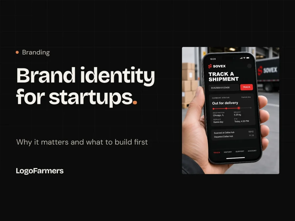
Most founders plan to "fix the branding later." Later usually arrives as an expensive rebrand, right when the company can least afford the distraction.
When you're early, every resource is stretched, so it's tempting to grab a quick logo, pick a color you like and move on to the product. We understand the instinct. But after more than a decade and 600+ identity projects at LogoFarmers, we've seen the same pattern again and again: the startups that treat brand identity as early infrastructure, not decoration, move faster later.
This guide covers what brand identity actually means for a startup, why it matters before you scale, and exactly what to build at each stage, so you spend on the right things at the right time.
Brand identity is more than a logo
A logo is the most visible piece, but a startup's identity is the full system people use to recognize and remember you:
- Logo system: a primary logo, a compact version and an icon that works as a favicon or app icon.
- Color: a small palette with clear jobs, not a dozen colors used at random.
- Typography: one or two typefaces used consistently across your site, product and deck.
- Voice: how you sound in headlines, onboarding, emails and support replies.
- Application rules: how all of the above comes together on real touchpoints.
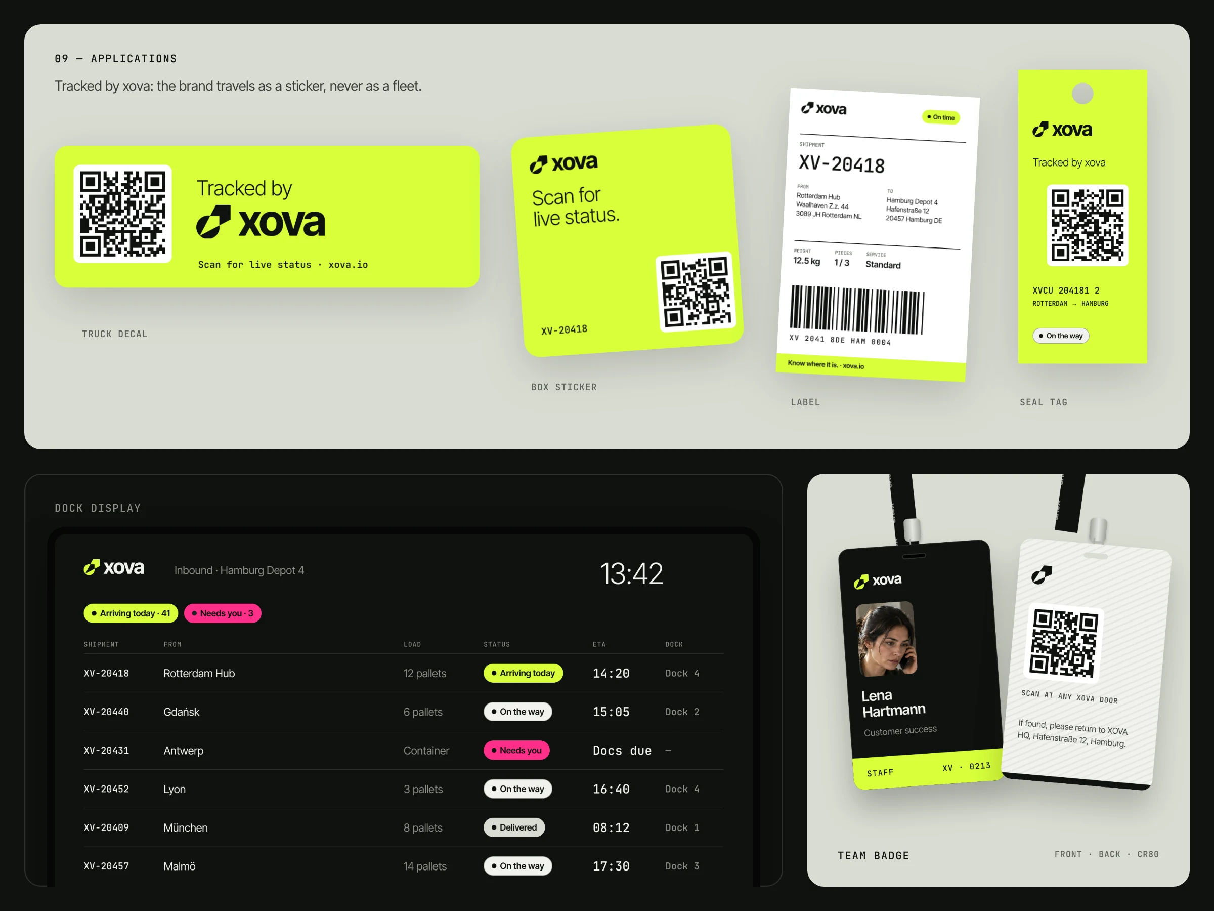
When these parts work together, a five-person team looks like a company worth trusting. When they don't, even a great product can feel unfinished.
Why brand identity matters early
1. You're judged before anyone tries your product
Investors, early customers and potential hires all form an opinion within seconds of landing on your website or opening your deck. They haven't used your product yet, so the only thing they can judge is how you present it. A considered identity signals that the team is serious, detail-oriented and here to stay.
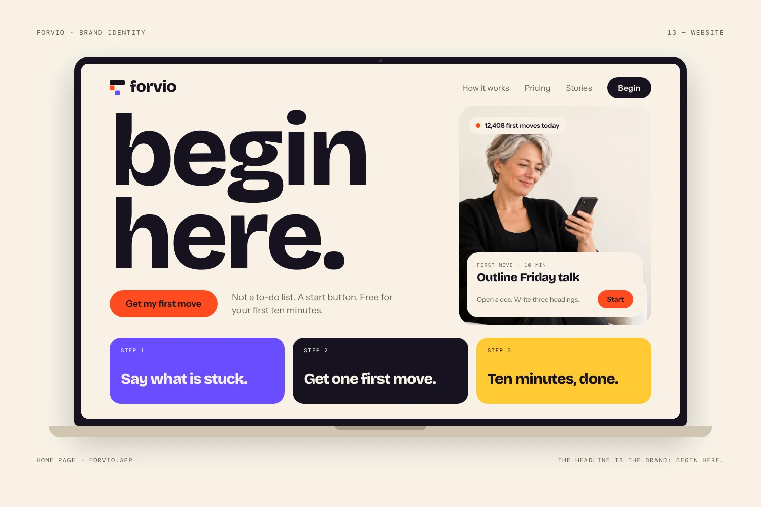
2. It turns a small team into a credible company
Early-stage startups don't have years of reviews, big logos on the homepage or a long track record. A clear, consistent identity fills part of that trust gap. It tells people you've thought carefully about the details, which makes them more willing to book a demo, sign up or take a meeting.
3. It separates you in a crowded category
Most new companies enter markets that already have well-funded competitors. Spend five minutes browsing any software category and you'll see the same gradients, the same blue and the same generic icons. A distinctive identity is one of the few advantages you can create on day one, regardless of your budget or headcount.
4. It saves money later
Rebranding a company with paying customers is far more expensive than getting the foundation right early. By then your logo lives on your app, app store listings, sales decks, invoices, social profiles, partner sites and printed material. Every one of those has to be changed, and you risk confusing the customers you worked hard to win.
5. It makes every marketing effort compound
Recognition builds through repetition. When your ads, posts, emails and product all look and sound the same, each one reinforces the last. When they don't, each touchpoint starts from zero, and you pay for that in higher acquisition costs.
Your brand is the first product every customer tries.
What to build at each stage
You don't need a 60-page brand book before you have customers. You do need the right foundation for the stage you're in. Here's how we usually advise founders:
| Stage | Build now | Can wait |
|---|---|---|
| Idea / MVP | A distinctive logo with an icon version, one or two core colors, one typeface | Full guidelines, illustration style, templates |
| Launch / first customers | Complete logo system, defined palette with clear roles, type scale, short brand guide, website and deck applied consistently | Motion system, merchandise, sub-brands |
| Growth / scaling | Full brand guidelines, templates for the team, voice and messaging rules, illustration and photo direction | Only things that don't serve a real touchpoint |
The principle is simple: build what people will actually see in the next six to twelve months, and make sure it's designed as a system that can grow, not a one-off you'll need to throw away.
The mistakes we see most often
- Starting with a template or generator. It looks fine on day one, but it's rarely ownable or trademarkable, and someone else is probably using the same mark. (We cover this in the risks of generic logo templates.)
- Designing before deciding on positioning. If you can't say who you serve and why you're different, the designer is guessing. Answer that first.
- Too many colors. A palette where every color has a job is easier to use and easier to recognize. Here's why two signal colors beat a full palette.
- Designing for one size only. Your mark has to work as a 16px favicon, an app icon and a billboard. Test it small and in one color before you commit.
- Inconsistency across touchpoints. The website says one thing, the deck another and the product a third. Small differences add up to a brand that feels unreliable.
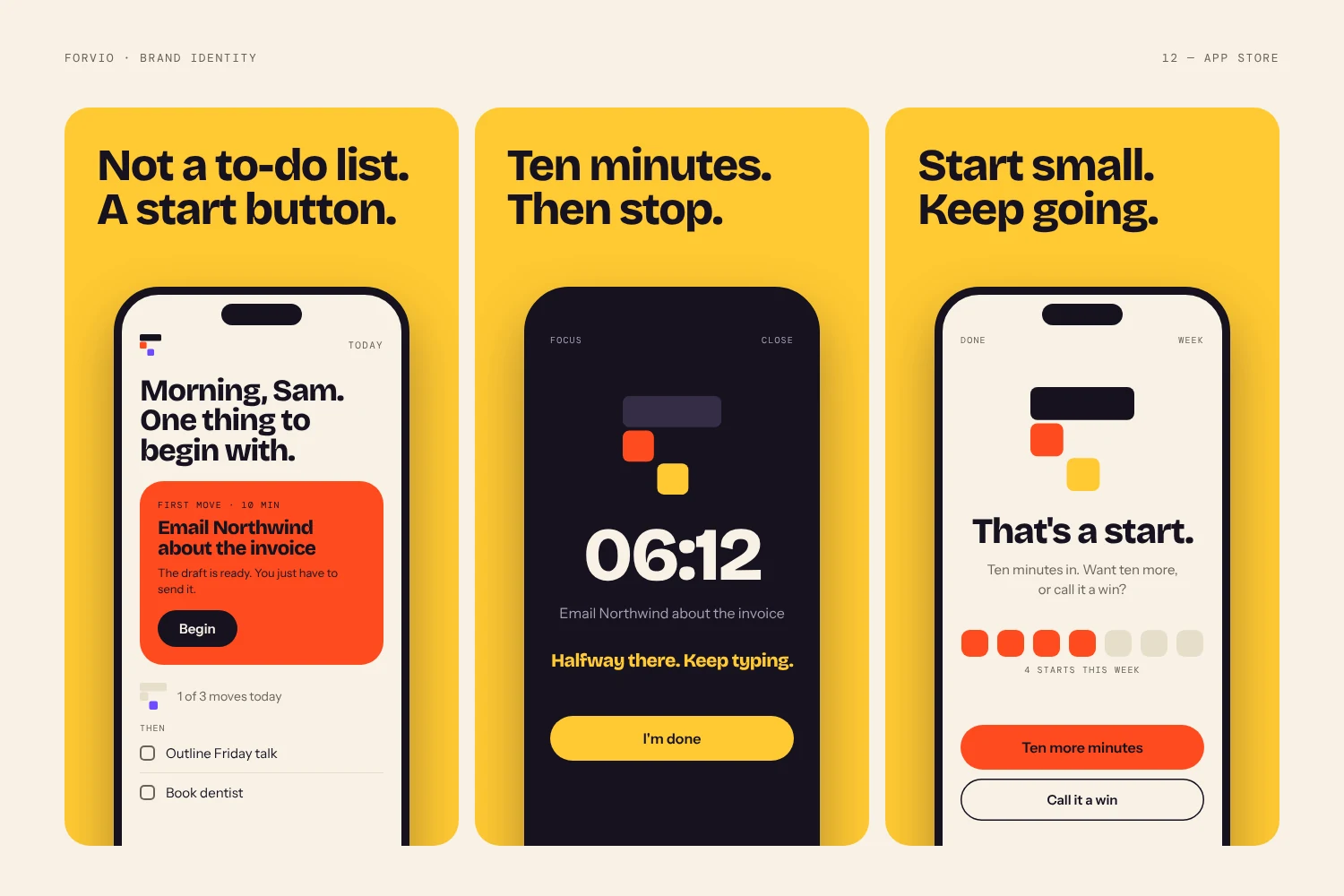
See it in practice
For a real example of how this plays out, from positioning to logo system to product UI, read our Forvio SaaS identity case study. It shows how a focused, systematic identity gives a young product the presence of an established one.
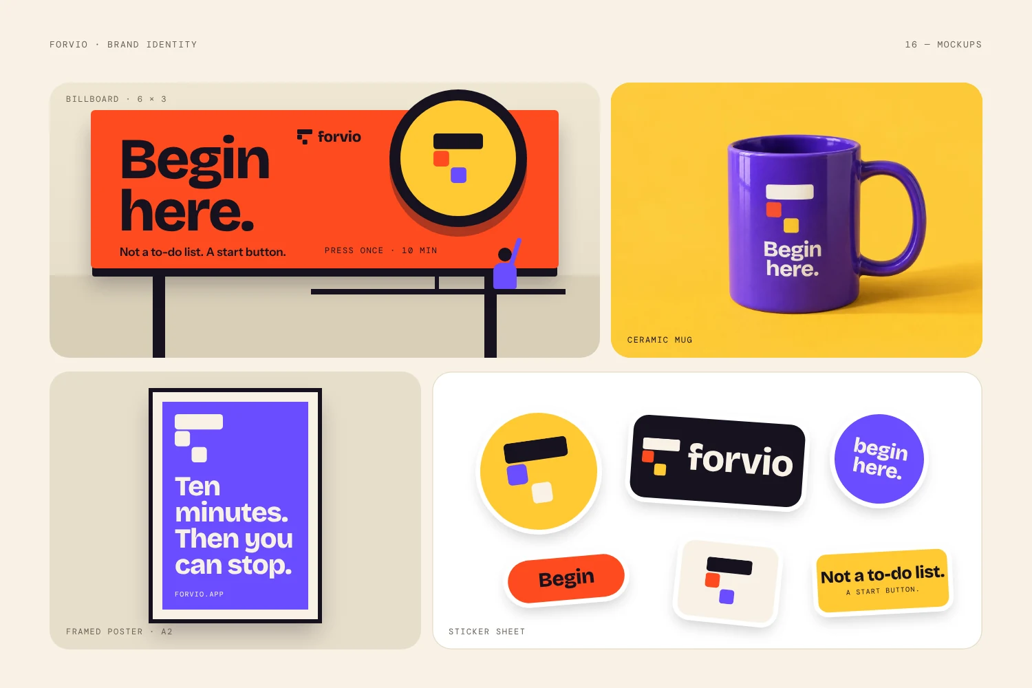
A quick checklist before you launch
- Can you describe your positioning in one sentence?
- Does your logo work at 16px, in black and white and as an app icon?
- Does every color in your palette have a defined job?
- Do your website, deck and product use the same type and colors?
- Is there a short guide your team or freelancers can follow?
- Do you own the files (vector formats) and, ideally, the trademark?
If you answered "no" to more than two of these, it's worth fixing before you put real money behind marketing. If you're not sure who should do it, here's how to choose a brand designer who understands your business.
Building a startup brand?
Tell us about your product and stage. We reply within 24 hours and recommend the right package.