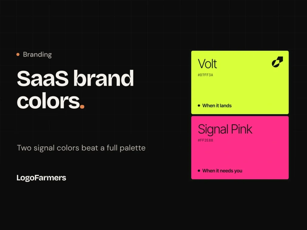
Most SaaS brands don't need more colors. They need fewer colors that each mean something.
Open any product dashboard and count the colors. Blue buttons, green badges, orange charts, a purple gradient in the header, a red dot somewhere. Each one made sense on its own. Together they cancel each other out, and the one thing the user needed to see gets lost.
In this post I'll show the rule we used for XOVA, a freight tracking app: keep the brand quiet in neutrals, and give exactly two colors a job. You'll get the ratio, the reasoning, and a checklist you can use on your own palette.
Why most SaaS palettes fail
They treat color as decoration instead of information. A palette gets built in a brand workshop, five or six swatches that look good side by side. Then the product team has to use them, and every color ends up everywhere.
Three problems follow:
- Nothing stands out. When the logo, the buttons, the charts and the alerts all use bright colors, the eye has nowhere to land.
- Colors lose their meaning. If your brand green is also your "success" green and your chart green, users can't tell a decorative green from a real status.
- The brand gets harder to recognize. Six colors used equally have no signature. One color used rarely and on purpose becomes the thing people remember.
The fix isn't a better palette. It's giving each color a job, and making most of them stay quiet.
The signal rule
Neutrals carry the brand. Signal colors carry meaning. Keep the signals under about 10% of what people see.
It works the way a hi-vis vest works on a building site. The site is gray and brown, so the vest is the first thing you notice. Put everyone in hi-vis and nobody stands out.
In practice that means two kinds of color:
- Neutrals (90% or more): a dark, a light and one or two grays. They hold backgrounds, text, cards and photography. They set the mood and make everything else readable.
- Signals (10% or less): one or two strong colors, each with a single job. They only appear when something needs to be seen: a status, an alert, the one action that matters.
Why two signals and not one? One signal can only say one thing, usually "good" or "look here". Most products need to say two things: "all good" and "you need to act". A third signal is where the palette starts to get loud again.
Worked example: the XOVA palette
XOVA is a freight tracking app with one promise: know where it is. Its users are operations teams who check dozens of shipments a day, so the color system had to answer one question fast: is anything wrong?
| Color | Hex | Share | Job |
|---|---|---|---|
| Ink | #0F110F | 60% | Backgrounds, text, the product UI |
| Paper | #F1F2EC | 22% | Light surfaces, cards, print |
| Stone | #D9DCD2 | 12% | Secondary surfaces, maps, dividers |
| Volt | #D7FF3A | 4% | Signal 1: arrived, on time, the logo, the main button |
| Signal Pink | #FF2E88 | 2% | Signal 2: needs you (a delay, a hold, a missed scan) |
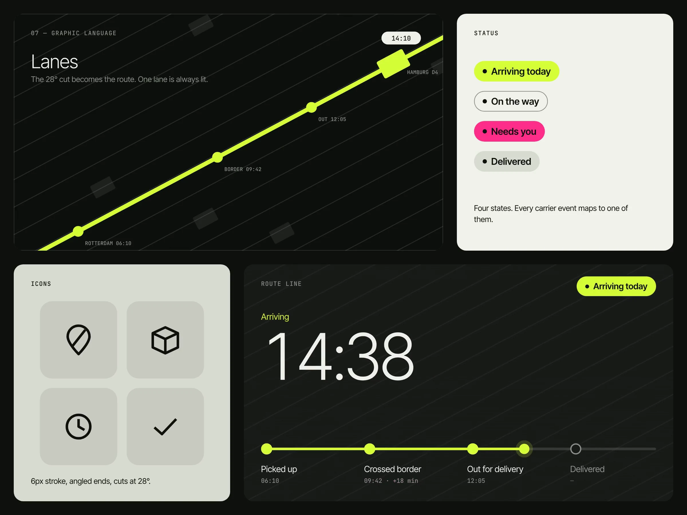
The status language shows the rule at work. Every carrier event maps to one of four plain words:
- Arriving today: Volt pill. Good news, no action needed.
- On the way: outlined pill, no color. Normal, so it stays quiet.
- Needs you: Pink pill. Something went wrong and a person has to act.
- Delivered: Stone pill. Done, so it fades back.
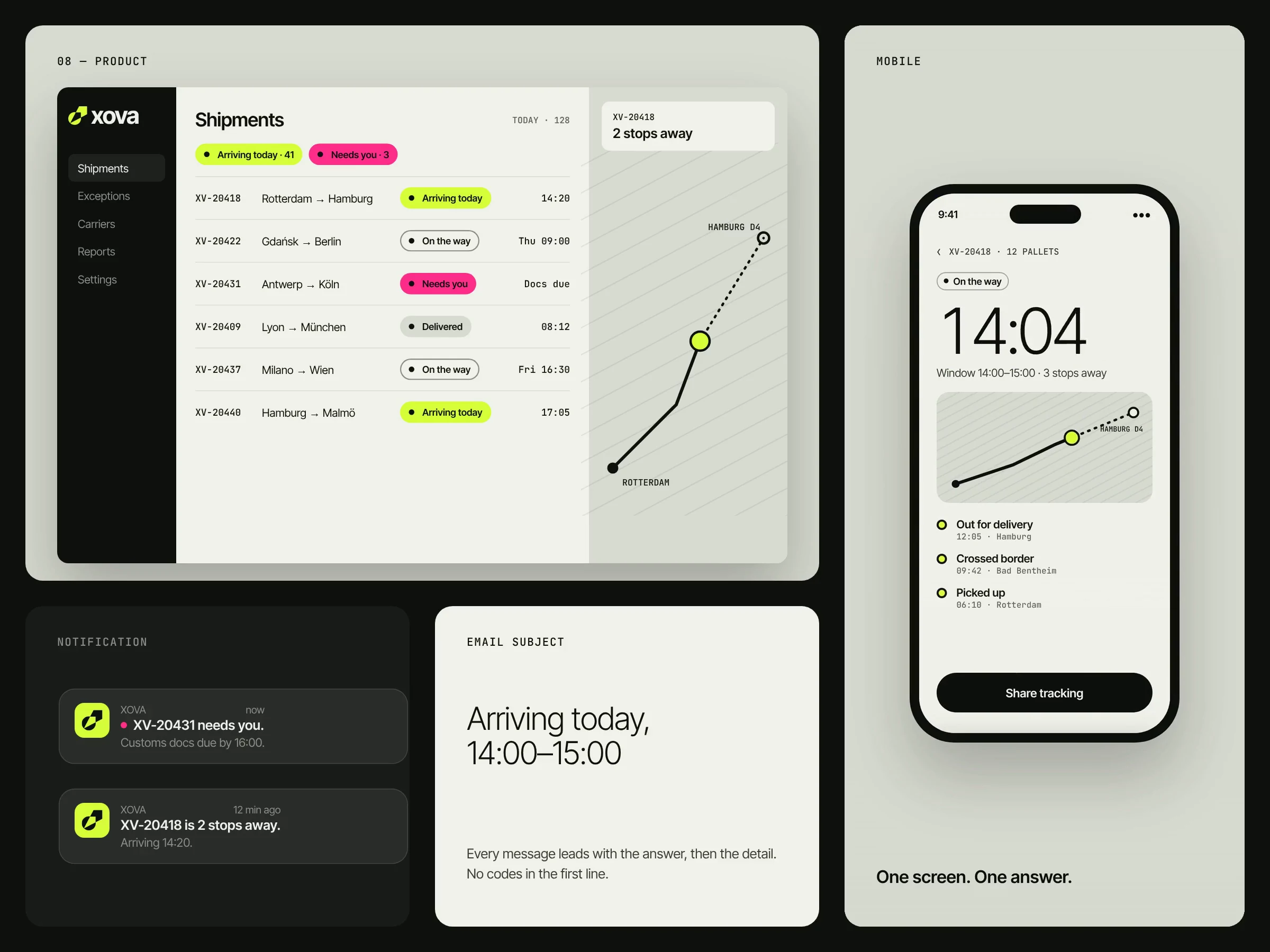
Only two of the four states get a color. A dock screen with forty shipments shows a wall of quiet rows, a few Volt arrivals, and one or two pink rows. The team sees the problem in under a second.
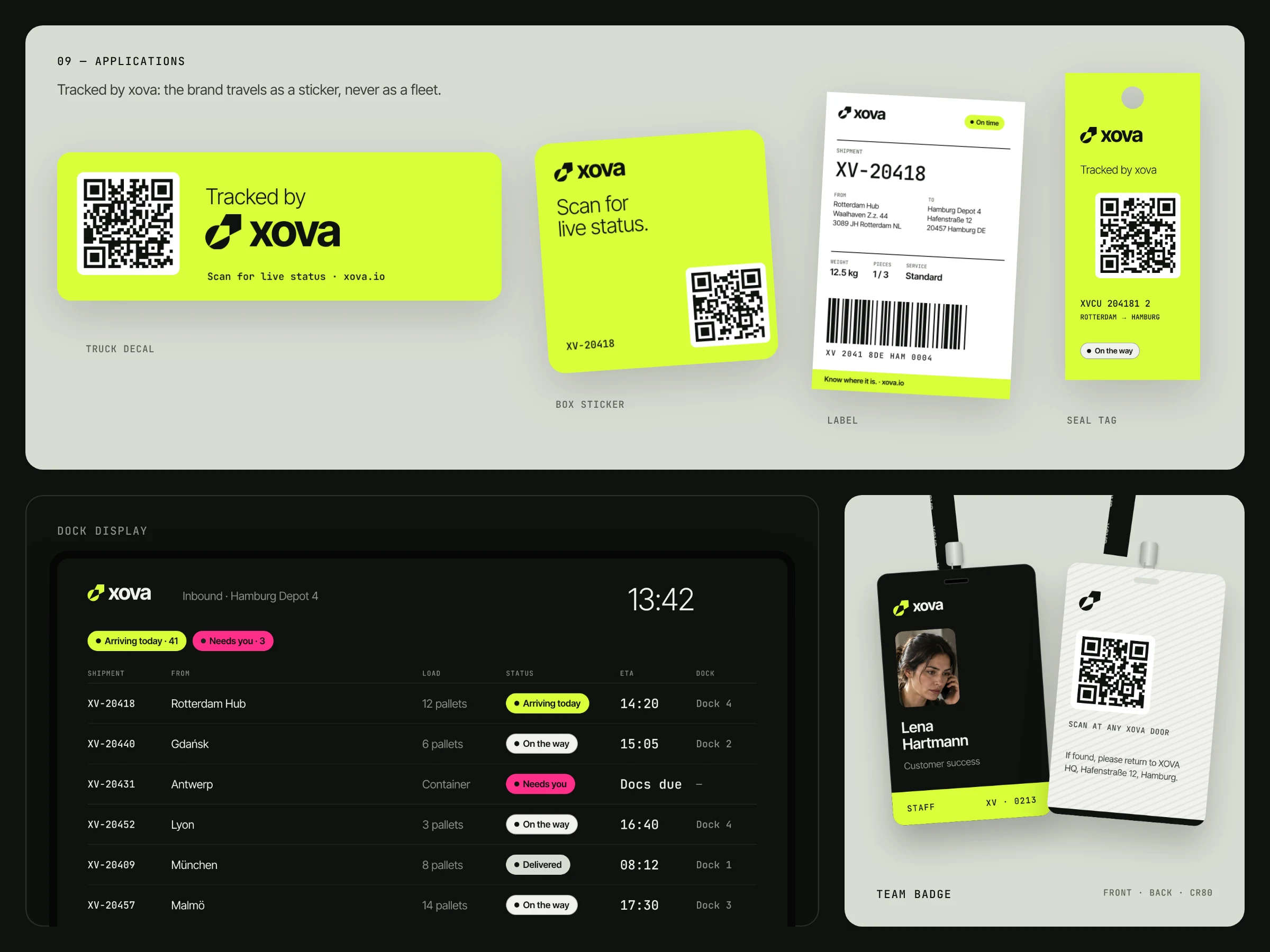
The brand line came straight out of this: Pink when it needs you. Volt when it lands.
How we chose the second color
We picked Pink because it had a better job, not because it looked better. XOVA started with one signal, Volt. Black and lime is common in tech right now, so we tested a second color to make the brand more distinctive.
The first candidate was a bright cyan for "live, in transit". It looked clean, but its job was weak: "in transit" is the normal state, and normal states should stay quiet. Coloring it would have made the most common rows the loudest ones.
Pink worked because we gave it the opposite job: exceptions. In logistics, exceptions are exactly what operations teams act on. We scored both options on five criteria (1 to 10):
| Criterion | Cyan (live) | Pink (exception) |
|---|---|---|
| Stands out from other black and lime brands | 6 | 9 |
| Meaning in logistics | 8 | 9 |
| Pairs with Volt | 8 | 7 |
| Looks professional, not playful | 9 | 7 |
| Stands out in a feed | 7 | 9 |
| Average | 7.6 | 8.2 |
The lesson: decide the job first, then the color. A color without a clear job is decoration, however good it looks.
Rules that keep it working
A signal system only works if the team protects it. These are the rules we wrote into the XOVA guidelines:
- Signals never fill large areas. Pills, dots, a line, one button. A full pink background turns an alert into decoration.
- One signal per element. Never Volt and Pink on the same pill, card or chart. Each element says one thing.
- Never the second signal on the logo. The logo uses the brand signal (Volt) or neutrals. Pink is for product states only.
- Dark text on both signals. Ink on Signal Pink has a contrast ratio of about 5.4:1 and passes accessibility checks for small text. White on the same pink is only about 3.5:1. Ink on Volt passes easily.
- Normal states stay neutral. "On the way" and "Delivered" get outlines or gray, never a signal color. If everything is highlighted, nothing is.
- Check the ratio on real screens. Screenshot a busy dashboard and a marketing page. If the signals cover more than about 10%, something has crept in that doesn't have a job.
Pick your own signal colors in five steps
- List the moments that matter. Write down the two things your users most need to notice. For XOVA: "it arrived" and "you need to act". For a finance app it might be "paid" and "overdue".
- Choose your neutrals first. One dark, one light, one or two grays. Test them with real UI and photos before you pick any bright color.
- Give signal 1 the good news and the brand. This is your signature color. It goes on the logo, the main button and positive states.
- Give signal 2 the problem. Pick a color far from signal 1 on the color wheel, so the two never get confused at a glance. Avoid pure red if your product isn't about danger: it reads as an error, not an action.
- Set the ratio and write it down. Something like 60 / 22 / 12 / 4 / 2. Put it in your brand guide with the rules above, so designers and developers keep the signals rare.
The short version
A strong SaaS palette is mostly quiet. Let neutrals carry the brand, give two colors a clear job, and keep them rare. Your users will see what matters faster, and your brand will be easier to remember because its color always means something.

See the full system in the XOVA brand identity case study: mark, color, product UI, motion and applications.
Need a palette that works this hard?
Tell us about your product. We reply within 24 hours and recommend the right package.