How to Create a Logo System (Primary, Secondary, Icon)
Your logo has to work on a storefront sign, a business card, a website header, an Instagram avatar and a 16-pixel browser tab. No single logo can do all of that well. A detailed mark that looks great on a poster turns into a smudge at favicon size, and a tiny icon on its own feels empty across a wide banner.
That’s why strong brands don’t have a logo. They have a logo system.
After more than ten years and 600+ logo and identity projects at LogoFarmers, this is the process we use to build one, from the first sketch to the final file folder.
What is a logo system?
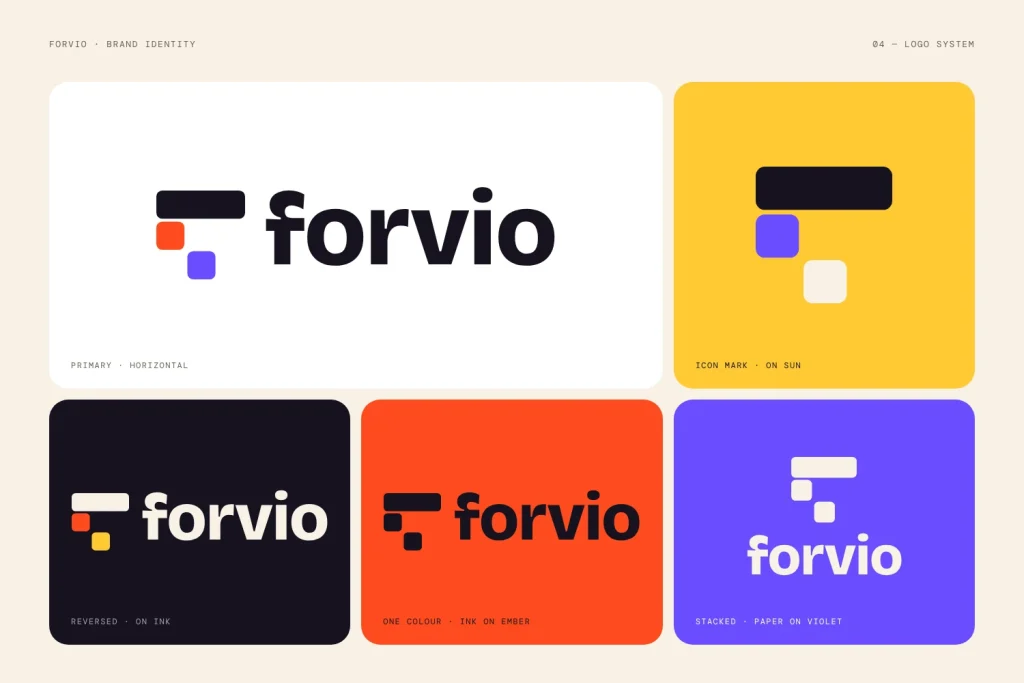
Forvio: one primary logo, a stacked version and an icon, each in several colour versions.
A logo system is a family of related logo versions, each built for a specific size, shape or context, that all read as the same brand. Most systems have three core parts:
Primary logo: the full, “hero” version of the brand.
Secondary logo: alternative arrangements (horizontal, stacked, wordmark-only) for spaces where the primary doesn’t fit.
Icon (or brand mark): the smallest, simplest version, used where space is tight.
On top of those sit the rules that hold everything together: colour versions, clear space, minimum sizes and usage guidelines.
Version
What it includes
Typical uses
Primary
Symbol + brand name (+ tagline, if any)
Website hero, packaging, signage, pitch decks
Secondary – horizontal
Symbol beside the name
Website header, email signature, letterhead
Secondary – stacked
Symbol above the name
Square or tall spaces, merch, posters
Wordmark
Brand name only
Footers, co-branding, places where the symbol already appears nearby
Icon
Symbol or monogram only
Favicon, app icon, social avatars, stamps, embossing
Step 1: Map where the logo will live
Before you design anything, list every place the logo will realistically appear. A café needs cups, signage and an Instagram avatar. A SaaS company needs a favicon, an app icon and a dark-mode dashboard. A logistics brand needs truck livery and shipping labels.
This list tells you which versions you actually need. It also stops you from designing a beautiful primary logo that breaks the moment it meets a real touchpoint.
Quick exercise: sort your touchpoints into three groups: wide (headers, banners, vehicles), square (avatars, merch, posters) and tiny (favicons, app icons, labels). Each group points to a version in your system.
Step 2: Design the primary logo with reduction in mind
The primary logo is the most complete expression of the brand, but don’t design it in isolation. The best systems are planned from the start so the smaller versions can be pulled out of the primary rather than invented later.
While you design, keep asking:
Does the symbol still work if the name is removed?
Does it still read at 32px?
Does it work in one flat colour?
If the answer is no, simplify now. It’s much harder to fix later.
Pro tip: design in black and white first. Colour can hide weak shapes. If the logo works in solid black, it will work everywhere.
A “lockup” is a fixed arrangement of the symbol and the name. Secondary logos are new lockups of the same parts, not new designs.
Horizontal lockup: symbol on the left, name on the right. This is usually the workhorse, because most website headers and email signatures are wide and short.
Stacked lockup: symbol centred above the name, for square and portrait spaces.
Wordmark only: the name on its own, for places where the symbol would be repetitive or too small to read.
To keep lockups consistent, use one measurement from the logo itself as your unit. For example, the height of a capital letter in the brand name. Then set the gap between symbol and name as a multiple of that unit (say, 1× in the horizontal version and 0.75× in the stacked one). This keeps proportions consistent across every version, and anyone can rebuild the lockups correctly later.
Step 4: Create the icon. Reduce it, don't just shrink it
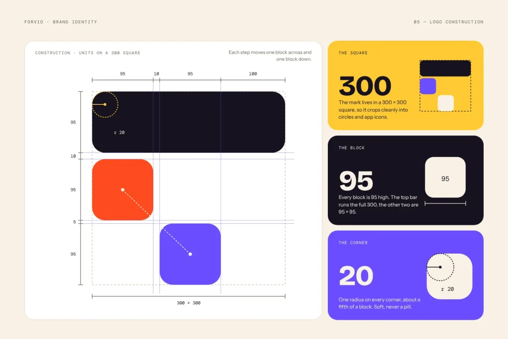
Forvio: the icon built on a grid and checked at 300px, 95px and 20px.
This is where most logo systems fail. Scaling the primary symbol down to 16px is not the same as designing an icon.
Small sizes need optical adjustments:
Remove fine detail: thin lines, small gaps and texture disappear at small sizes.
Thicken strokes: what looks balanced at 500px looks fragile at 24px.
Open up tight spaces: small counters (the holes in letters like “a” and “e”) fill in quickly.
Fit the container: app icons and social avatars are often cropped into circles or rounded squares, so check the icon inside both.
If the symbol is too complex to simplify, a monogram (one or two letters from the brand name) is a strong alternative.
Test it: export the icon at 16px, 32px and 48px and put it in a real browser tab next to other sites’ favicons. If you can’t recognise it at a glance, keep simplifying. Google also shows your favicon in search results, so check its favicon guidelines.
Step 5: Define colour versions
Every version of the logo needs to work on light backgrounds, dark backgrounds and in limited-colour printing. A complete set usually includes:
Full colour: the default, on white or light backgrounds.
Reversed (white): for dark backgrounds and photography.
One colour: for screen printing, embroidery, engraving and stamps.
Black: for newspapers, invoices, fax-style documents and low-cost print.
Also note the exact colour values for each medium: HEX and RGB for screens, CMYK for print, and Pantone if the brand uses spot colours. A blue that looks right on a monitor can print dull if the CMYK values aren’t set properly.
Step 6: Set clear space and minimum sizes
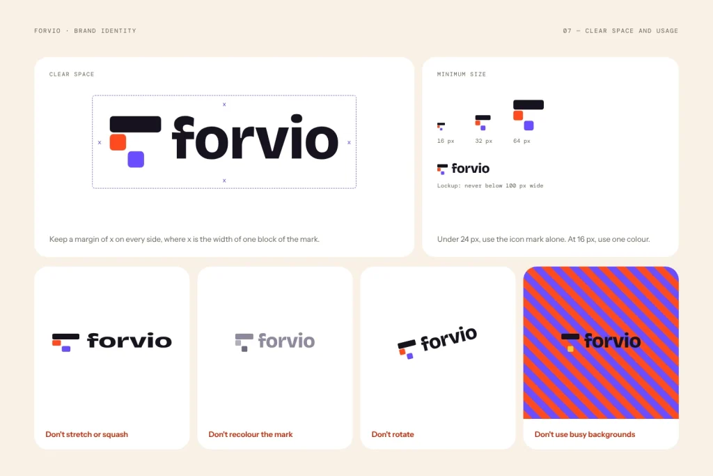
Forvio usage rules: clear space, minimum sizes and what not to do.
Clear space is the empty area around the logo that nothing else should enter. Instead of a fixed number like “20px”, define it using a part of the logo, so it scales with the logo. A common rule: clear space on every side equals the height of the symbol, or half of it for tighter layouts.
Minimum size is the smallest size at which each version stays legible. Set one per version, for both screen and print. As a starting point:
Primary logo: around 120px wide on screen / 30mm in print
Horizontal lockup: around 100px wide / 25mm
Icon: 16px / 6mm
Test your own logo and adjust. A logo with a tagline will need a larger minimum size than one without.
Step 7: Write the "which version, when" rules
A logo system is only useful if people pick the right version. Give your team, printer and web developer a simple decision guide:
Is there plenty of space? Use the primary.
Is the space wide and short? Use the horizontal lockup.
Is it square or tall? Use the stacked lockup.
Is it smaller than the primary’s minimum size, or a favicon, avatar or app icon? Use the icon.
Is the background dark or busy? Use the reversed version.
Also show the most common mistakes to avoid: stretching, rotating, changing colours, adding shadows or outlines, rearranging elements and placing the logo on busy photos without enough contrast.
Step 8: Package the files properly
A great system can still fail if the files are messy. Deliver every version in every colour, in the right formats:
SVG: websites and apps (sharp at any size)
PNG (transparent): presentations, documents, social media
PDF / EPS: printers and sign makers
ICO or 32px PNG: favicon
Use a clear, consistent naming pattern so anyone can find the right file in seconds, for example:
Then organise folders by version (Primary / Secondary / Icon), with subfolders for colour and file type.
Step 9: Test it in the real world
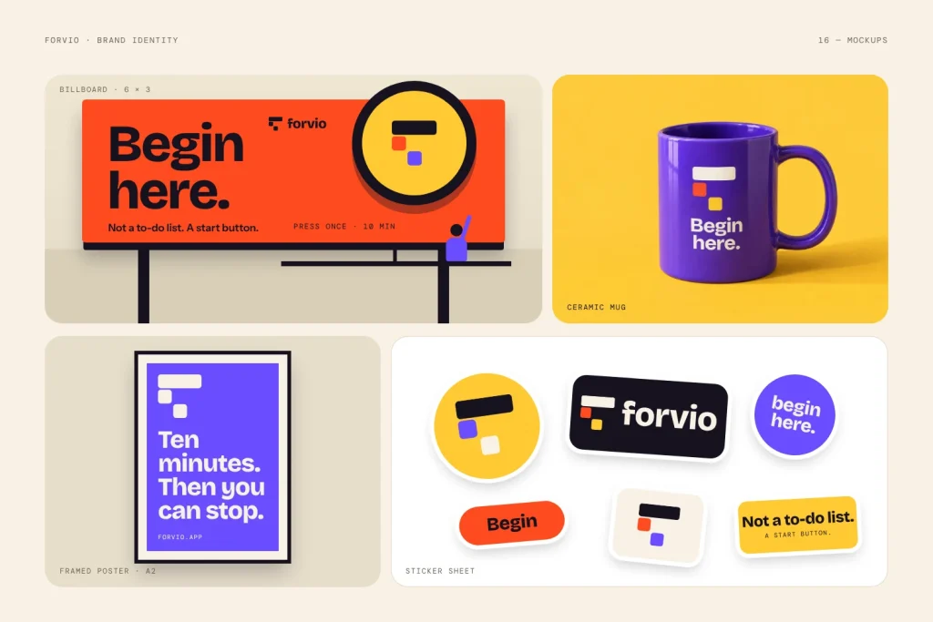
Forvio: the full system tested on a billboard, mug, poster and stickers.
Before you call it finished, put every version into real mockups: a website header on a phone, a dark-mode screen, a social avatar, a business card, a shirt and a sign seen from across the street. Print it small on a cheap office printer. Look at it on a low-brightness screen.
Real-world testing will show problems that a perfect artboard never will.
Common logo system mistakes
Too many versions. Five well-built versions beat twelve confusing ones. Only create what your touchpoints need.
Versions that look like different brands. Every version should share the same shapes, type and colours.
Shrinking instead of reducing. The icon needs its own optical adjustments.
No rules. Without clear space, minimum sizes and usage examples, people will improvise.
Forgetting dark mode. More apps and websites now default to dark backgrounds. Test the reversed version early.
Logo system checklist
☐ Primary logo
☐ Horizontal lockup
☐ Stacked lockup
☐ Wordmark
☐ Icon / monogram, optically adjusted for small sizes
☐ Full-colour, reversed, one-colour and black versions
☐ HEX, RGB, CMYK (and Pantone) values
☐ Clear space rule
☐ Minimum sizes for screen and print
☐ “Which version, when” guide and incorrect-use examples
☐ SVG, PNG, PDF/EPS and favicon files, clearly named
FAQ
What’s the difference between a primary and a secondary logo?
The primary logo is the main, most complete version of the brand. Secondary logos are alternative arrangements of the same elements, built for spaces where the primary doesn’t fit, like a wide header or a square avatar.
How many logo versions does a brand need?
Most brands need three to five: a primary, one or two secondary lockups, a wordmark and an icon, each in a few colour versions. Small businesses can often start with a primary, a horizontal lockup and an icon.
Is the icon the same as a favicon?
Not quite. The icon is the brand mark used in any small space. The favicon is one specific use of it: the tiny image in a browser tab. Your favicon is usually made from your icon, sometimes with extra simplification.
Can I add a logo system to an existing logo?
Yes. A designer can build secondary lockups, an icon and usage rules from your current logo. If the original is too detailed to simplify, it may need a light refresh first.
Need a logo system built for you?
At LogoFarmers, every identity project is built as a system, not a single file. You get a primary logo, secondary lockups, an icon that works at 16px, colour versions and simple usage rules, all packaged and ready for your team, printer and developer.