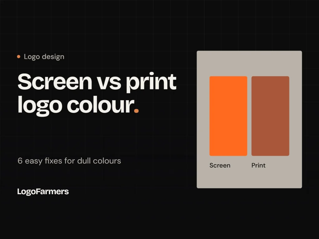
Why Your Logo Looks Different on Screen vs Print: 6 Easy Fixes
You open your new logo on screen and it looks perfect. Then you print it, and the blue is flat, the black looks grey and the edges are soft. This is the most common reason a logo looks different on screen vs print, and it is rarely a design mistake.
The cause is almost always colour mode, paper or file type. Once you know which one it is, each problem has a simple fix.
Why a Logo Looks Different on Screen vs Print: Quick Answer
What you see
Why it happens
Simple fix
Colours look duller
Screens glow with light, printers use ink
Convert to CMYK and check a proof
Colours shift between papers
Coated and uncoated paper absorb ink differently
Choose paper first, then check colour
Edges look fuzzy
A low-resolution file was used
Use a vector file (SVG, PDF or EPS)
Black looks grey
Screen black is not printer black
Set a rich black for large areas
Thin lines disappear
Fine details print lighter than expected
Use a print version with thicker strokes
1. Screens Use Light, Printers Use Ink
Screens mix red, green and blue light (RGB). Printers mix cyan, magenta, yellow and black ink (CMYK). Bright, glowing colours such as electric blue, vivid green and neon orange sit outside what ink can reproduce, so they print duller. This is the main reason a logo looks different on screen vs print.
Fix: ask for a CMYK version of your logo for print, and keep the RGB or HEX version for web and social media. Compare both so you know what to expect.
2. Paper Changes the Colour
The same ink looks different on glossy, matte and uncoated paper. Uncoated paper absorbs ink and makes colours softer. Coated paper keeps them brighter.
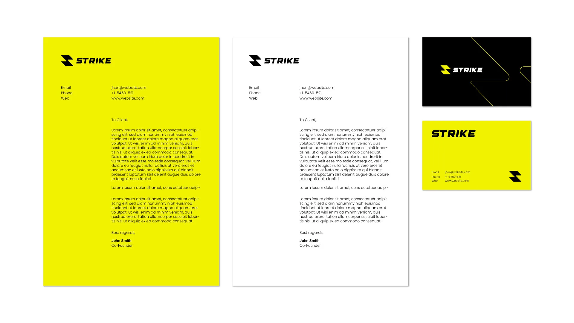
Fix: choose the paper first, then judge the colour on that paper. The Strike stationery below uses a bright yellow, a white sheet and a black card, and each colour needs checking on the stock it will be printed on.
Strike stationery: the same logo on yellow, white and black print.
3. Use a Vector File for Print
A small PNG or JPG that looks sharp on screen can turn blurry on a large print, because it only holds a fixed number of pixels. A vector file keeps clean edges at any size. Read our guide to vector vs raster logos if you want the full explanation.
Fix: send printers a vector PDF, EPS or SVG. If you must use an image file, make sure it is large enough, usually around 300 DPI at the final print size.
4. Fix Dull Blacks and Greys
Black on screen is a light that is switched off. Black on paper is ink, and a single black ink can look weak and slightly grey across a large area. Small text prints well in plain black, but large black areas often need a richer mix of inks.
Fix: ask your printer which black they recommend for large areas, and keep small text in plain black so it stays sharp.
5. Check Thin Lines and Small Details
Hairlines, tiny text and fine gaps look crisp on a bright screen but can fill in or fade on paper, especially on soft stock. A logo that depends on small details may need a print version with slightly thicker strokes.
Fix: print the logo at its smallest real size and check that every line is still clear.
6. Ask for a Proof Before the Full Print Run
Never judge colour from a screen alone. A printed proof shows you what customers will actually see, and it is far cheaper to fix a proof than a full run of 1,000 cards.
The Orbit business cards below were designed in several colours, and a proof is how you confirm that the green and teal stay true on paper. It is also the best way to settle any argument about why a logo looks different on screen vs print.
Orbit business cards: colour is confirmed on paper before the full run.
Mistakes That Make Print Colour Worse
Most print problems come from a few avoidable habits when a logo looks different on screen vs print:
Sending an RGB file to a printer and letting them convert it without checking.
Using a screenshot or a web image instead of the original vector file.
Approving colour on a phone screen with brightness turned up.
Screens use light (RGB) and printers use ink (CMYK). Paper type and file quality also change the result, so a logo looks different on screen vs print even when the design is perfect.
Should I use RGB or CMYK for my logo?
Use RGB or HEX for websites, social media and apps. Use CMYK for anything printed, such as cards, packaging and signs.
Why does my printed logo look blurry?
The file is usually too small or low resolution. Use a vector file, or a high-resolution image at the final print size.
Can a logo look exactly the same on screen and in print?
Not exactly, because light and ink behave differently. A good designer gets them very close, and a printed proof confirms the final result.