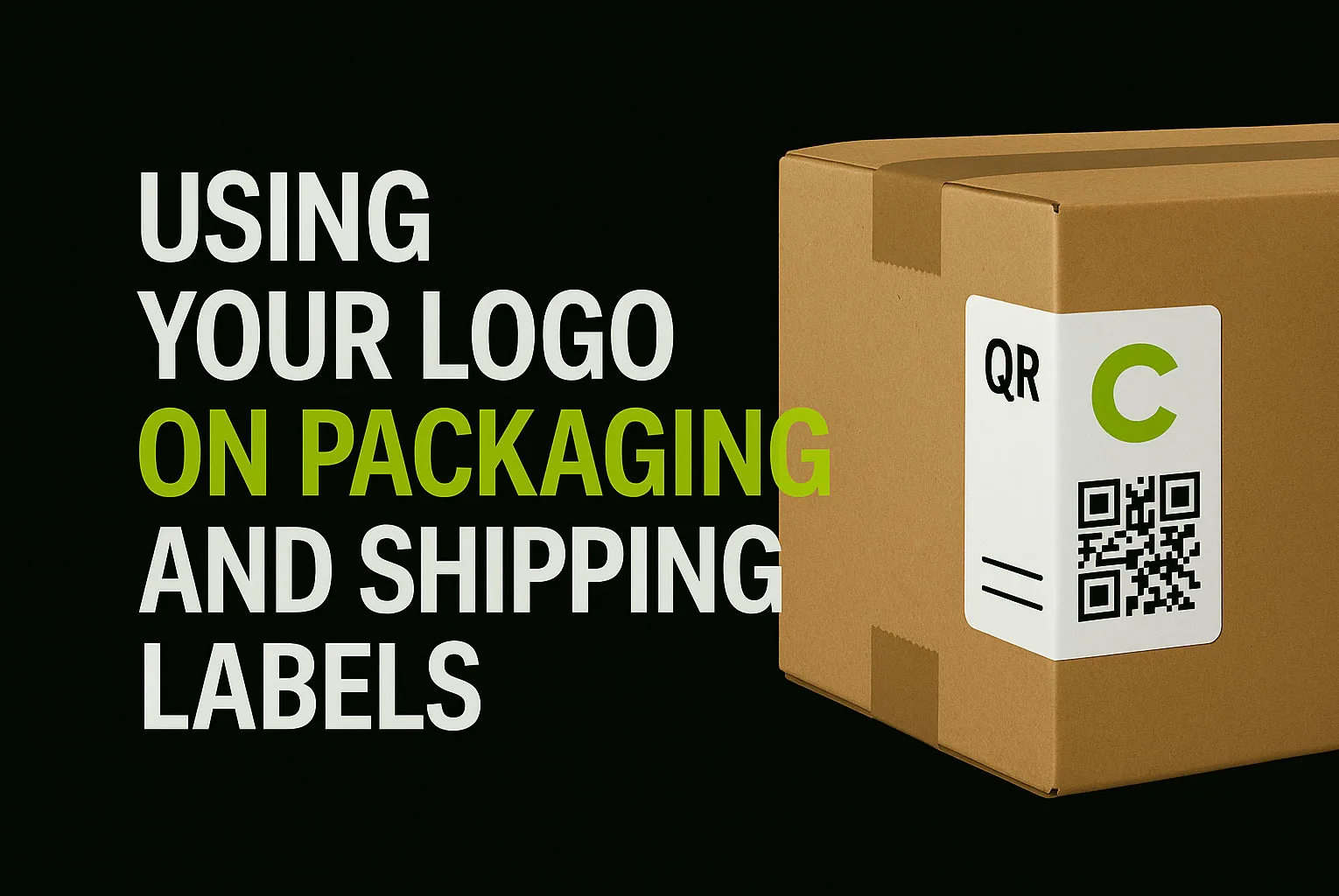
Using your logo on packaging and shipping labels is one of the smartest ways to reinforce your brand in the real world. Packaging is more than just protection — it’s part of the customer experience.
Whether you’re selling clothing, handmade goods, or tech products, the moment someone touches your packaging, they’re interacting with your brand. And your logo? It’s often the first thing they see.
At LogoFarmer’s Studio, we don’t just design logos for screens — we create brand assets that perform on packaging, shipping labels, stickers, and more.
In this guide, you’ll learn how to use your logo on packaging and shipping labels to maximize brand recognition and impact.
1. Use the Right Logo Variation for Each Material
A complete logo system includes:
Primary logo (icon + name)
Icon-only version
Black-and-white version
Horizontal or stacked formats
Use the full logo on large surfaces like boxes, shopping bags, or printed wrapping paper.
Use the icon version on tight areas — like shipping labels, corner stamps, or branded tape.
Tip: Make sure the version you’re using is high-contrast, legible, and vector-based for sharp print results.
2. Optimize for Contrast and Material Type
Packaging comes in many forms — cardboard, paper, plastic, kraft, or coated materials — and each surface interacts with your logo differently. To keep your brand looking professional and polished across all packaging types:
Avoid placing light logos on pale or kraft backgrounds without strong contrast
Use black or white logo variations that pop clearly
Always test your design on a mockup before moving to final production
According to Forbes, clear and confident packaging design plays a key role in building brand recognition — especially when it leans on simplicity and consistency.
3. Be Minimal — Let Your Logo Stand Out
Clean packaging makes your brand feel more premium.
Avoid crowding your box or label with:
Too much text
QR codes next to logos
Multiple competing icons
Instead:
Place your logo with intentional whitespace
Keep other elements subtle (website, tagline, or handle, if needed)
Let the unboxing moment feel designed, not noisy
4. Stay Consistent Across All Packaging Pieces
Every touchpoint — boxes, stickers, thank-you cards, shipping labels — should feel like part of one brand system.
✔ Use the same logo version across all elements
✔ Keep colors and spacing consistent
✔ Align the packaging style with your digital presence
Even a simple logo sticker on plain packaging can increase brand memorability if used consistently.
5. Prepare the Right Files for Printers and Vendors
To ensure your logo looks clean and sharp in print:
Provide vector formats like .AI, .EPS, or high-res PDF
Include a CMYK version for accurate color reproduction
Use flattened files (no effects or transparency) for compatibility
Bonus: Ask your logo designer (or us) to prepare packaging-ready mockups to test before production.
Final Thoughts
Packaging isn’t just about delivery — it’s about delight.
And using your logo on packaging and shipping labels is how you turn customers into loyal fans.
From custom boxes to minimal shipping labels, your logo should feel clear, confident, and consistent — every time.
At LogoFarmer’s Studio, we build logo systems that are versatile, scalable, and print-ready — so your brand always shows up strong, whether online or on the shelf.
Want a logo that looks just as good on packaging as it does on screen?
Start Your Project ➔


