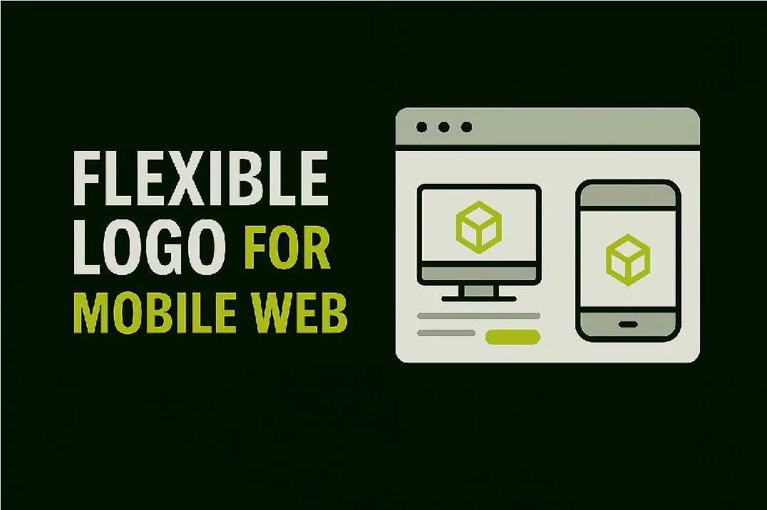
More than half of all website traffic today comes from mobile devices. That means your brand needs to look just as good on a phone screen as it does on a desktop. And where does it all start? With your logo.
If your logo isn’t flexible, your mobile-friendly website won’t feel professional or user-friendly. Here’s why.
1. Logos Need to Scale Down Clearly
On mobile screens, space is limited. A logo with tiny details or complicated shapes may look blurry or unreadable when scaled down.
Fix: Use a simple, clean logo design that stays recognizable at small sizes.
2. Multiple Versions Work Best
A flexible logo system includes full, stacked, and icon-only versions. This way, your brand looks consistent whether it’s on a phone header, app icon, or desktop website.
3. Fast Loading Matters
Large, complex logo files can slow down your site on mobile. A lightweight vector format (like SVG) keeps your logo sharp without hurting load speed — which also helps SEO.
4. Consistency Across Devices Builds Trust
When your logo looks perfect on every device, users trust your brand more. A bad mobile logo experience can make visitors think your business is outdated or unreliable.
5. A Flexible Logo Future-Proofs Your Brand
From mobile apps to social media to wearables, your logo needs to work across many platforms. Flexibility ensures your brand stays professional no matter where it appears.
Conclusion & Next Step
A mobile-friendly website doesn’t just need responsive layouts — it needs a flexible logo that works on every screen size. Together, they create a smooth, trustworthy experience for your visitors.
At LogoFarmer’s Studio, we design flexible, timeless logos that look perfect on both mobile and desktop websites.
💡 Want a logo that’s built for the mobile-first world?
Start Your Project Today →


