Spotting the signs your logo is damaging your brand early can save you months of lost trust. Your logo is often the first thing a customer sees, and within a few seconds it tells them whether you look like a business worth hiring.
Most owners miss the problem because they see their logo every day. Use the seven checks below with fresh eyes, or show your logo to someone who has never heard of your business.
Quick Check: Signs Your Logo Is Damaging Your Brand
| Sign | Quick test | What it costs you |
|---|---|---|
| 1. Looks outdated | Does it use heavy gradients, clipart or old fonts? | You look like a business that stopped moving |
| 2. Wrong message | Can a stranger guess what you sell and your price level? | You attract the wrong customers |
| 3. Hard to read | Shrink it to 32 pixels. Is the name still clear? | You disappear on phones and profile photos |
| 4. Looks like others | Put it beside five competitors. Can you spot yours fast? | You blend in and risk confusion |
| 5. Looks cheap | Does it look like free generator output? | Your prices feel hard to justify |
| 6. Breaks in formats | Try black, white, one colour and a square icon. | It fails on invoices, stamps and packaging |
| 7. Inconsistent | Compare your website, social and invoices. | The brand feels unreliable |
1. Your Logo Looks Outdated
A logo does not need to chase trends. But some details date it fast: heavy gradients, drop shadows, clipart and fonts from another decade. Customers read this as a sign that the business has not kept up, even when your service is excellent.
Test: compare your logo with five newer brands in your industry. If yours looks a generation older, it is working against you.
Fix: move to a simple, timeless mark with clean shapes. Keep what people already recognise, such as your main colour or initial.
2. It Sends the Wrong Message
A playful script for a firm that sells serious professional services, or a heavy industrial look for a gentle wellness brand, confuses people. The logo promises one thing and your business delivers another.
Test: show it to three strangers for five seconds. Ask what the company sells and who it is for. A wrong first guess is one of the clearest signs your logo is damaging your brand.
Fix: pick three words your brand should feel like, then match the shape, colour and type to them. Our guide on why brand identity is critical for startup success explains what to decide first.
3. It Is Hard to Read or Recognise
Fine details, thin lines and decorative fonts disappear on phones, favicons and social profile pictures. If people cannot read your name at a small size, they cannot remember it.
Test: shrink the logo to about 32 pixels wide. Can you still read the name and see the shape?
Fix: remove detail, thicken the strokes and add a simple icon version for small spaces.
4. It Looks Too Similar to Competitors
If your logo shares the same shape, colour and idea as others in your field, customers struggle to tell you apart. In the worst case, a very close match can lead to legal trouble. Follow our step-by-step guide to check if your logo is original before you commit to a design.
Test: place your logo in a row with five competitors. Can you pick yours out in two seconds?
Fix: keep a colour that is common in your category if it helps, but change the shape or idea so the mark is clearly yours.
This is general guidance, not legal advice. For trademark questions, speak to a qualified professional.
5. It Feels Cheap or Made From a Template
Free generators and template packs give you a logo that many other businesses may also use. It often looks rushed, and that changes how people judge your prices and your quality.
Fix: work with a professional designer, or choose a ready-made mark that is sold only once. Every mark in our logo shop is exclusive, so no one else will own it. If you are comparing designers, read how to choose a brand designer who understands your business.
6. It Does Not Work in Every Format
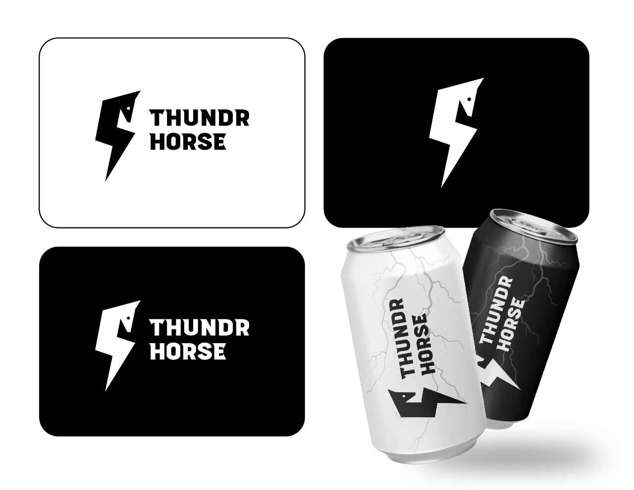
A logo that only looks right in full colour will fail on invoices, stamps, embroidery, packaging and dark backgrounds. A complete logo set avoids this.
Fix: ask for horizontal and stacked versions, an icon-only version, and colour, black and white versions. The Thundr Horse set below shows one mark in light, dark and icon-only forms, and on packaging.
7. It Looks Different Everywhere
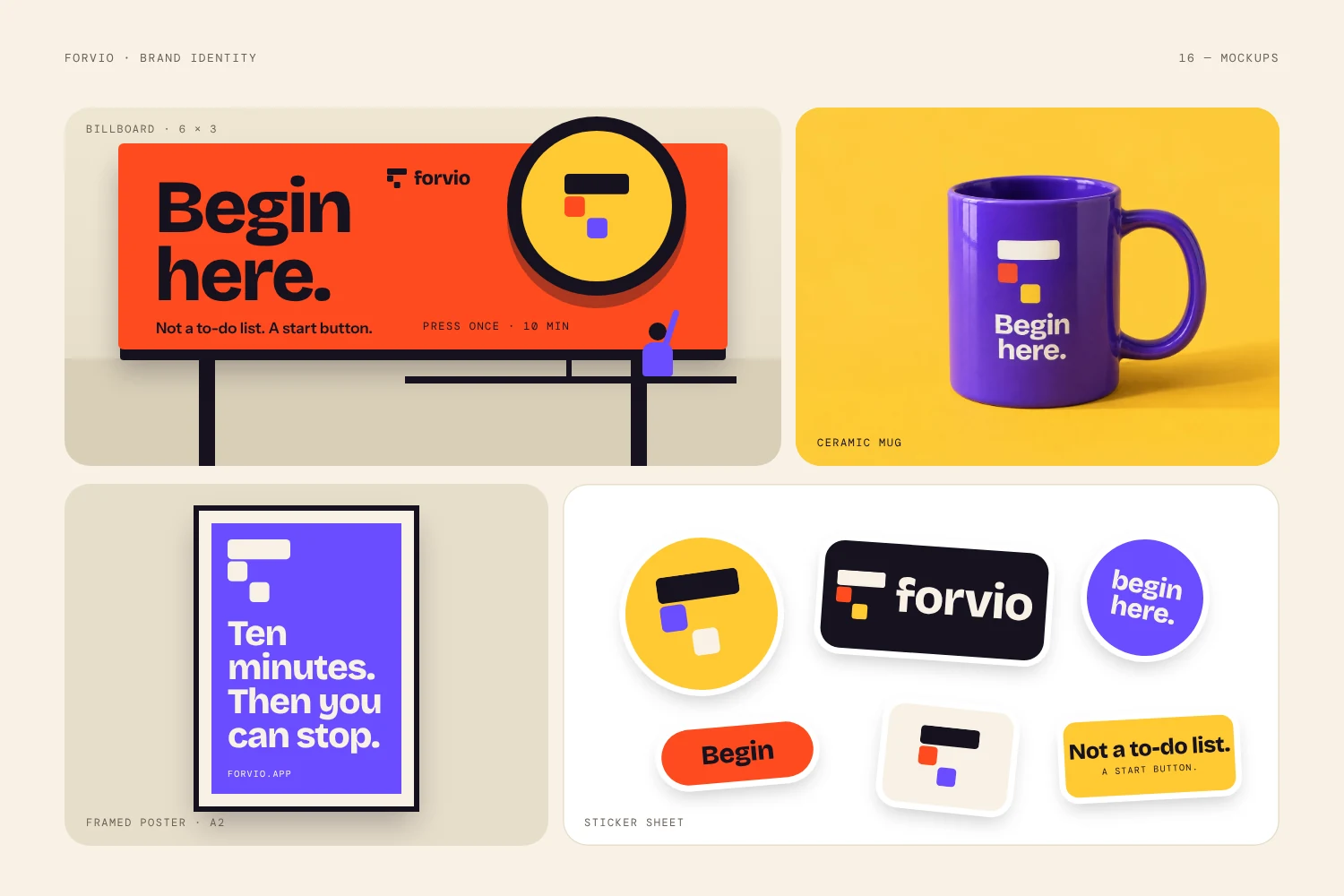
Different colours on your website, a stretched version on social media, an old file on your invoices: each one weakens recognition. People trust brands that look the same every time.
Fix: keep one master file for each logo version, and write down your colours, fonts and minimum size. Even a one-page guide helps. The Forvio identity below uses the same mark and the same style on a billboard, a mug, a poster and stickers.
Logo Refresh or Full Rebrand? How to Decide
Not every one of the signs your logo is damaging your brand needs a full redesign. A simple rule works well:
- Refresh when your name and idea are still right, but the drawing, colour or type feel dated.
- Rebrand when your business has changed direction, the message is wrong, or the logo is too close to another brand.
A rebranding works best when you keep what customers already recognise and change the rest on purpose. Tell people what changed and why.
Mistakes to Avoid When Fixing a Weak Logo
Fixing the signs your logo is damaging your brand the wrong way can cost as much as leaving them alone.
- Redesigning out of boredom. Change the logo for a reason, not because you are tired of it.
- Copying a trend or a competitor. A copy is the quickest way to blend in.
- Changing everything overnight. Keep one familiar element so loyal customers still recognise you.
- Fixing the logo but not the files. Replace the old version everywhere: website, social profiles, invoices and packaging.
Signs Your Logo Is Damaging Your Brand: FAQ
What are the signs that you need to change your company logo?
The clearest signs are an outdated look, a message that does not match your business, poor readability at small sizes, a close resemblance to competitors, and a logo that breaks in black and white or looks different across platforms.
Can a bad logo really lose you customers?
It is hard to measure exactly, but people judge a brand in seconds, and the signs your logo is damaging your brand add up quickly. A logo that looks cheap or confusing makes your business feel less trustworthy before anyone reads a word.
How often should a company update its logo?
There is no fixed rule. Many businesses make small refreshes every few years and change the logo fully only when the business changes direction or the old mark stops working.
What is the difference between a logo refresh and a rebrand?
A refresh improves the look of the existing mark. A rebrand changes the idea, message and identity behind it.
Not Sure If Your Logo Is Holding You Back?
If you recognise several of the signs your logo is damaging your brand, tell us what your business sells and who it serves, and we will point you to the right option. If you want a finished mark you can use right away, browse the logo shop, where every ready-made mark is sold only once. For a custom identity built around your company, start a project or email hello@logofarmers.com.